areas
• Design Audit + Competitive Analysis + Report
• Re-branding {Name, Logo, Visual System}
• Concept Development
• End-to-end Project Operations & Management
• Content Guidelines + Tone of Voice + Content Development
• Visual Guidelines {Colour, Typography, Illustration Style}
• Illustration Development
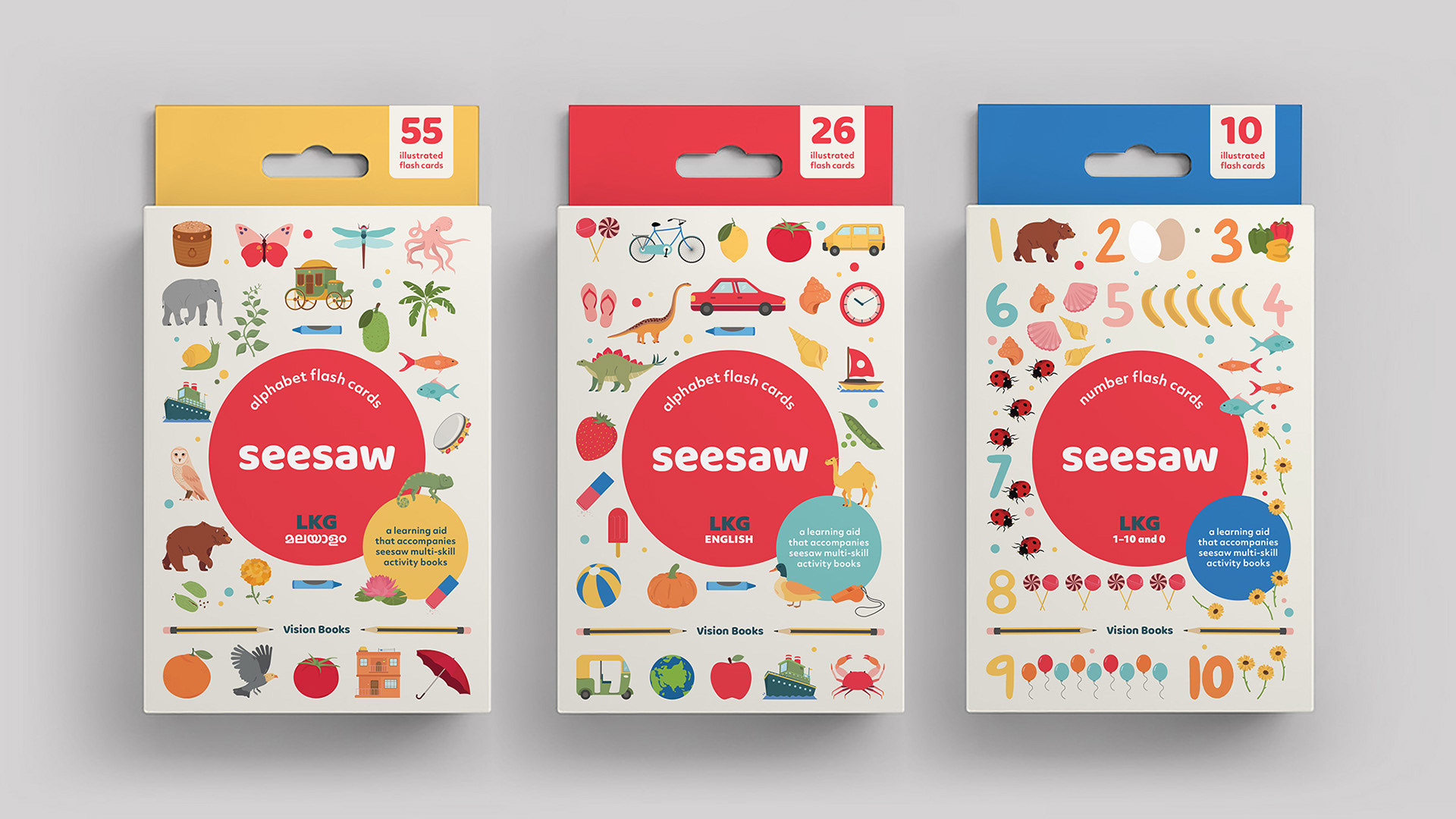
• Layout + Design {Activity Books, Guides, Posters, Flash Cards}
• Sales & Promotional Strategy Guidelines
CLIENT
PCM / Vision Books
SECTOR
Publishing
PERIOD
April 2020 – March 2022
RELEASE
May 2022
partners
team
Rhea Devchell, Jaya Iyer, Leeza John, Rahael Mathews, Kineri Shah, Srishti Shukla, Diya Verma (Illustration)
M A Joseph, Lakshmi K S (Editors, Malayalam)
Samir Krishnamurti (Editor, English)
Samir Krishnamurti (Editor, English)
Overview
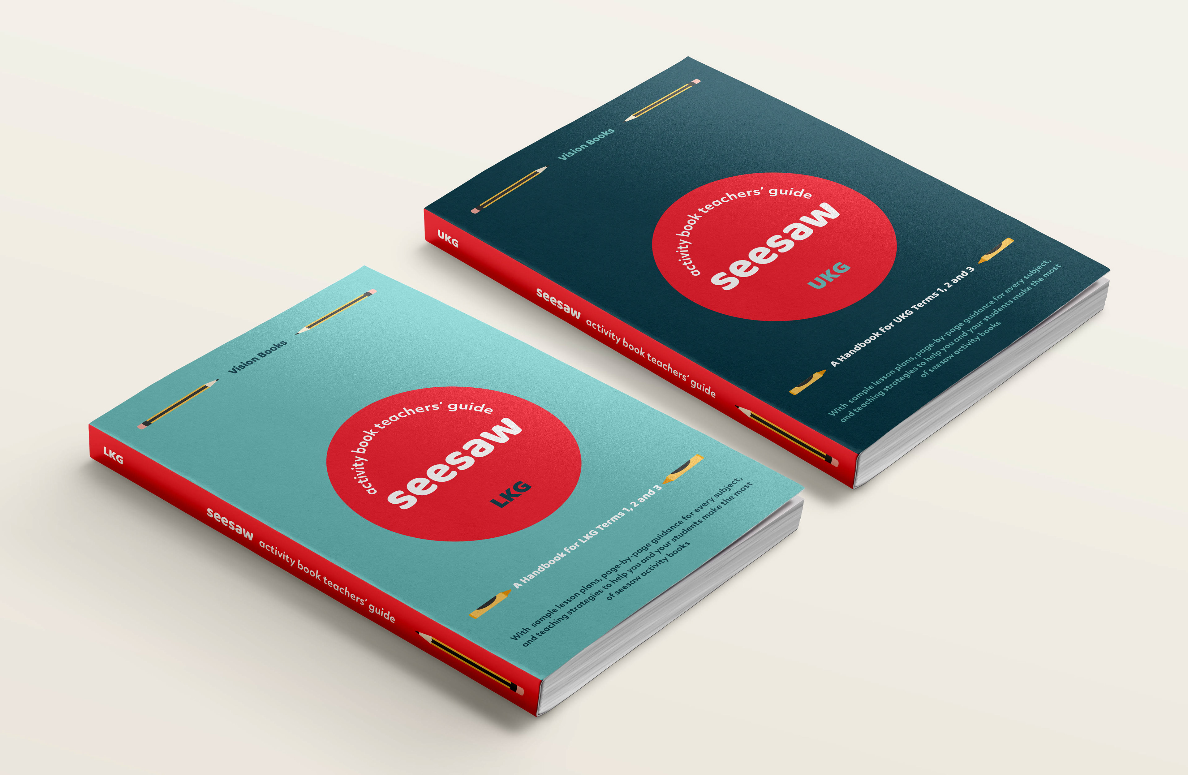
Seesaw (previously Blooming Buds) is published and distributed by Vision Books, a subsidiary of PCM Publishers, Kerala. In early 2020, we were approached to redesign a set of 6 activity books for children aged 4 to 6 years. We began with a design audit and competitive research as part of the first phase of the project, which raised concerns that went beyond design, leading us to propose a complete overhaul of the brand and product. The project, which we concluded in mid 2021, culminated in a set of 10 activity books, 4 teachers guides and learning aids for the classroom, designed to make both learning and teaching an enjoyable process- one that encouraged curiosity, engagement and forming connections.
The Name and Identity
We wanted a brand name young children could read and pronounce effortlessly- a name that was playful and fun to say out loud. A name that was memorable. And so, Blooming Buds was renamed Seesaw. With a name in place, we built an identity and visual style for Seesaw that was bold and distinct. The brand was brought to life with its word mark, set in Baloo – a typeface with playful, bouncy letterforms. Centred in white on a vibrant, tomato red circular base, the logo was the starting point for the brand’s unapologetically bold, bright visual style.
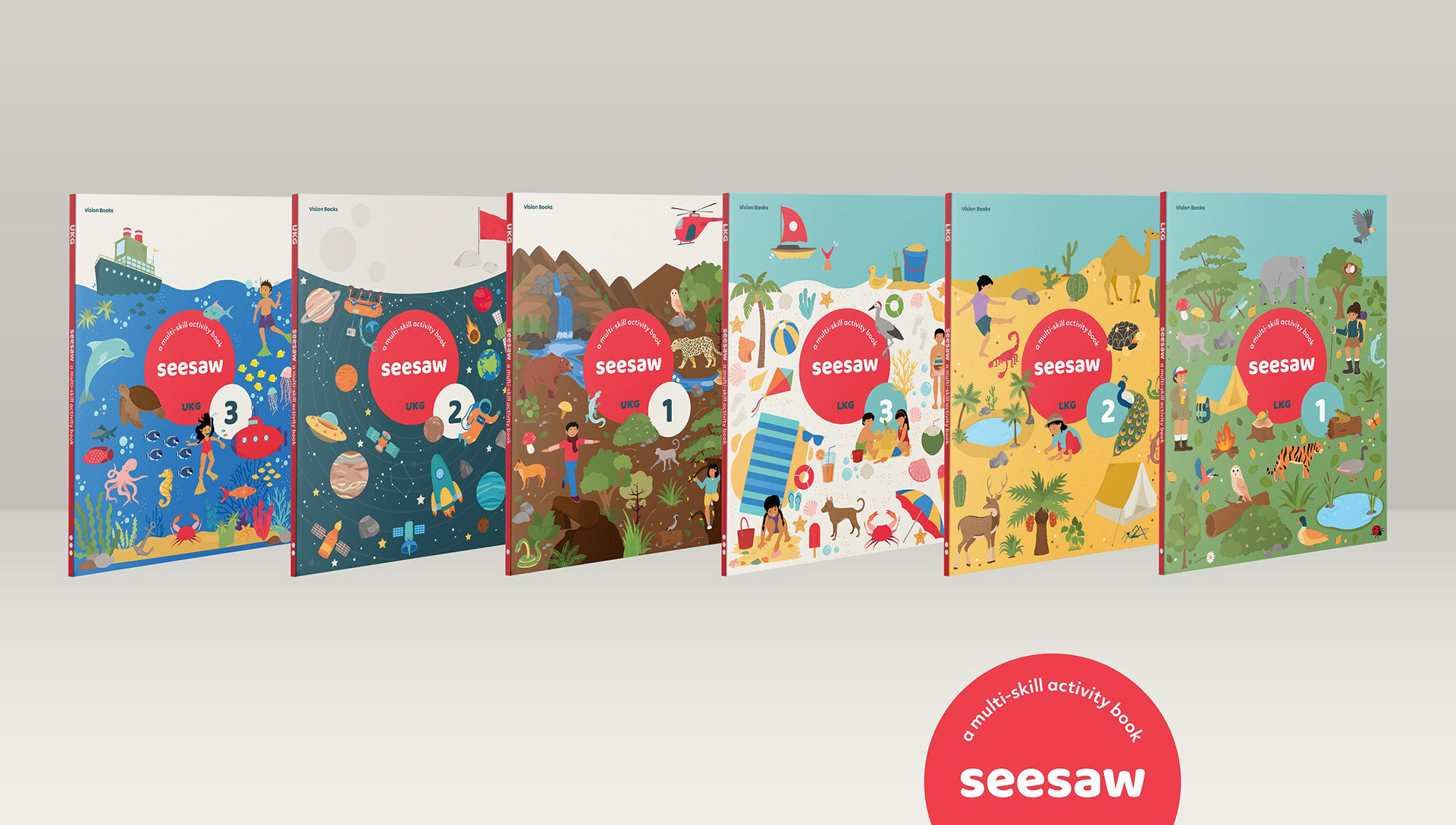
The Book Covers
With the brand identity in place, we began to build a unique visual system for Seesaw. Given the low production costs, we identified a flat vector illustration system with simple forms and pared back detail, a massive change from the heavily gradient-led illustrations in past books. We set out to embrace production and budgetary constraints rather than fight them, with a visual system that was inexpensive and scaled.
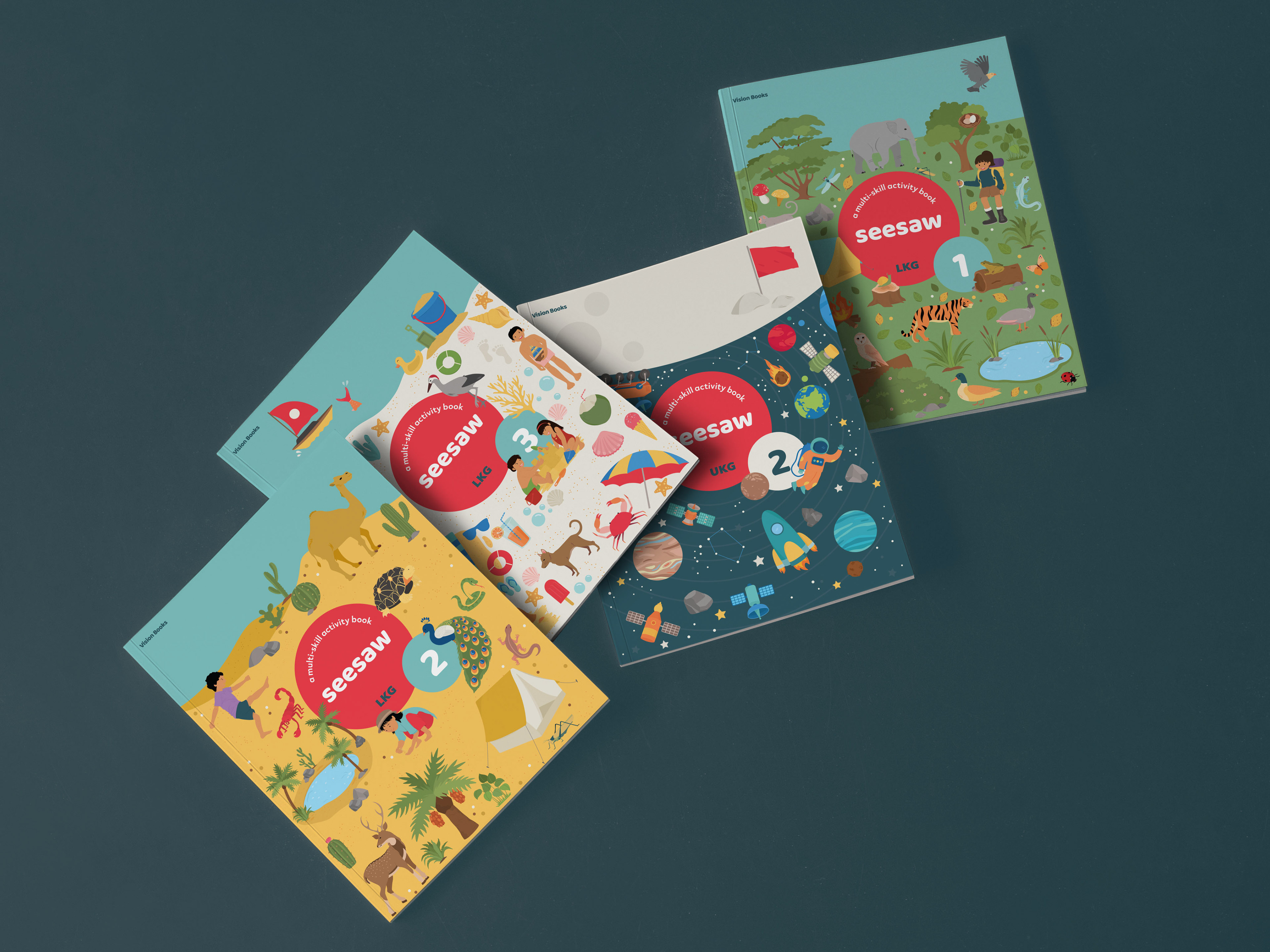
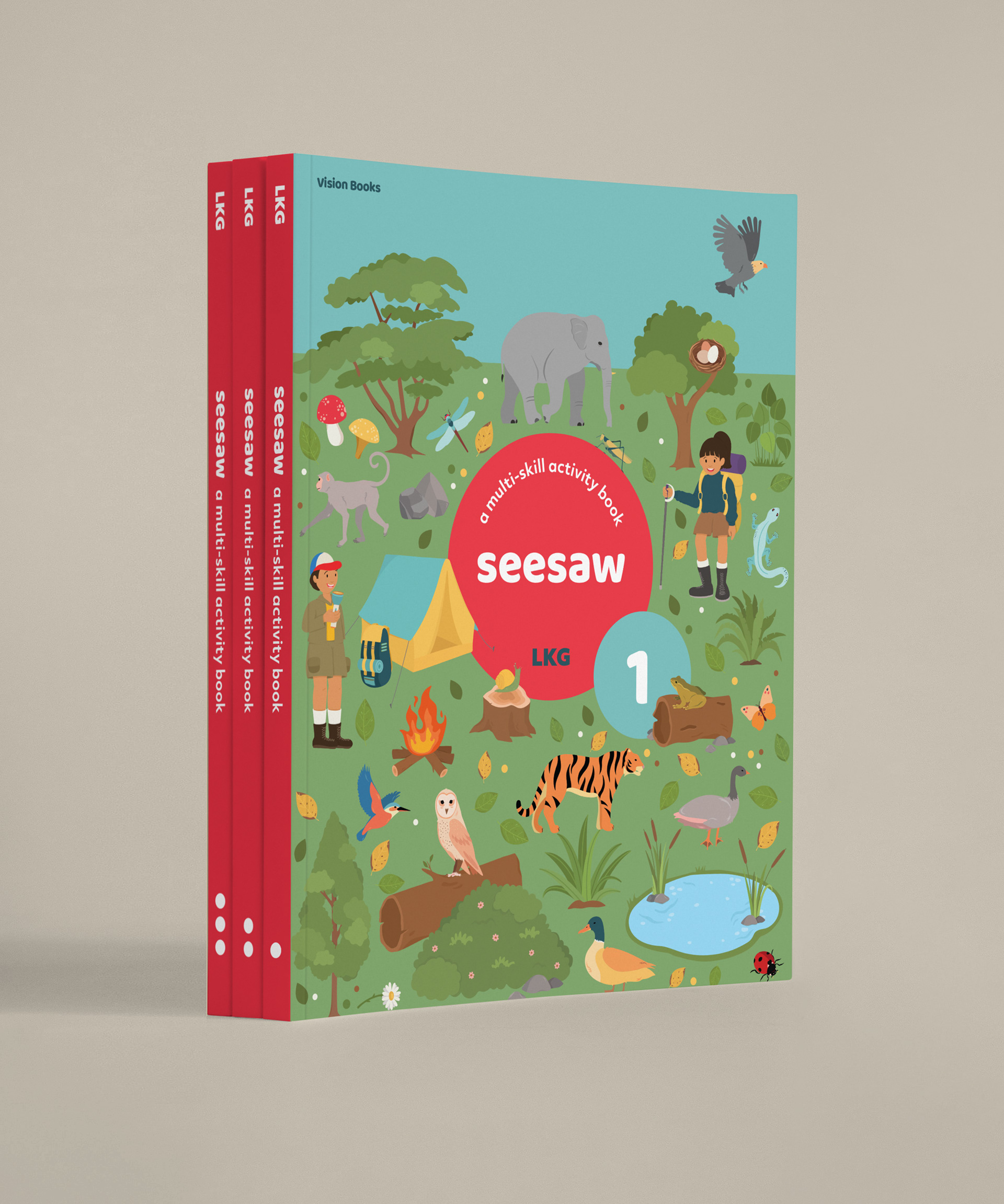
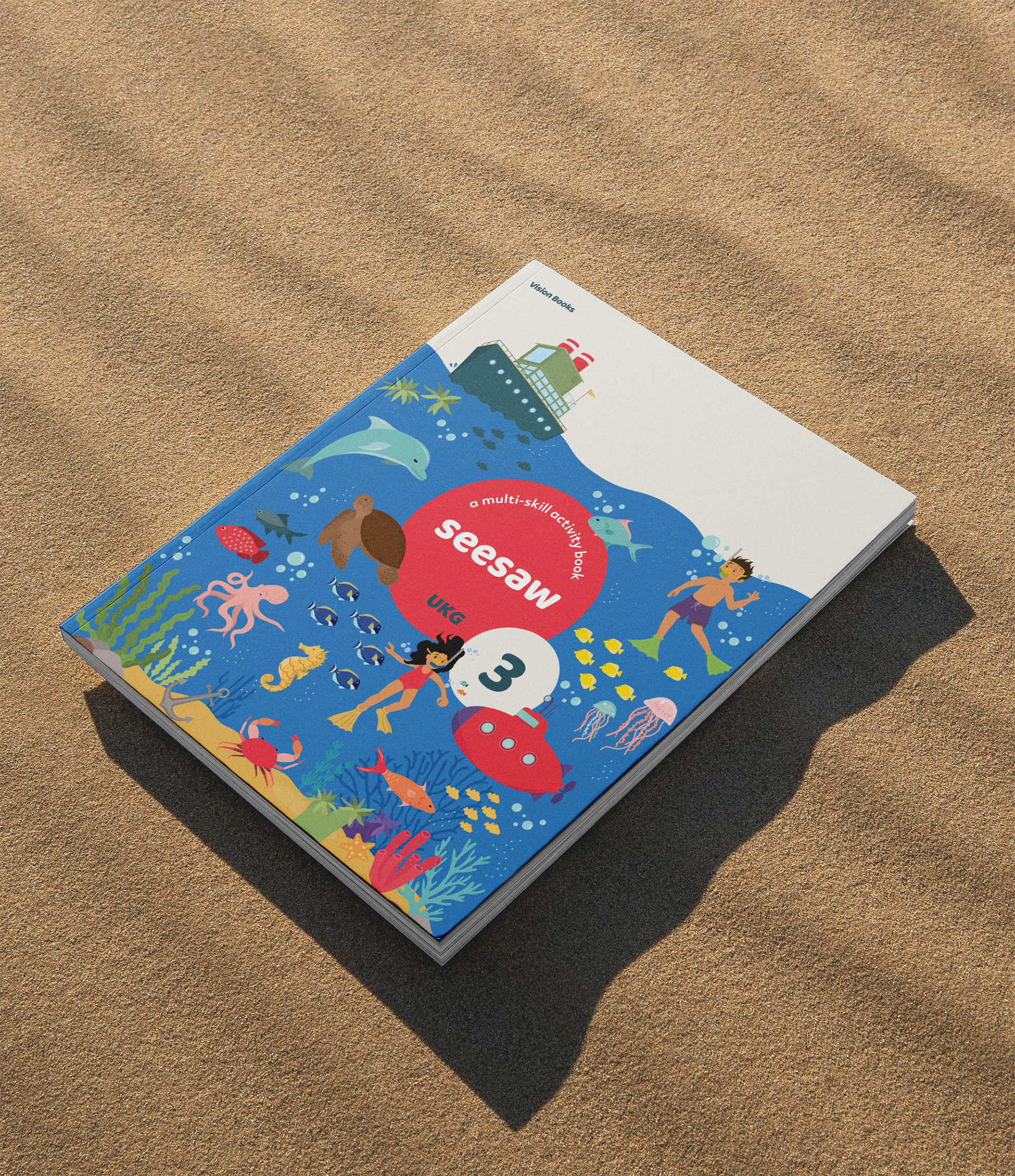
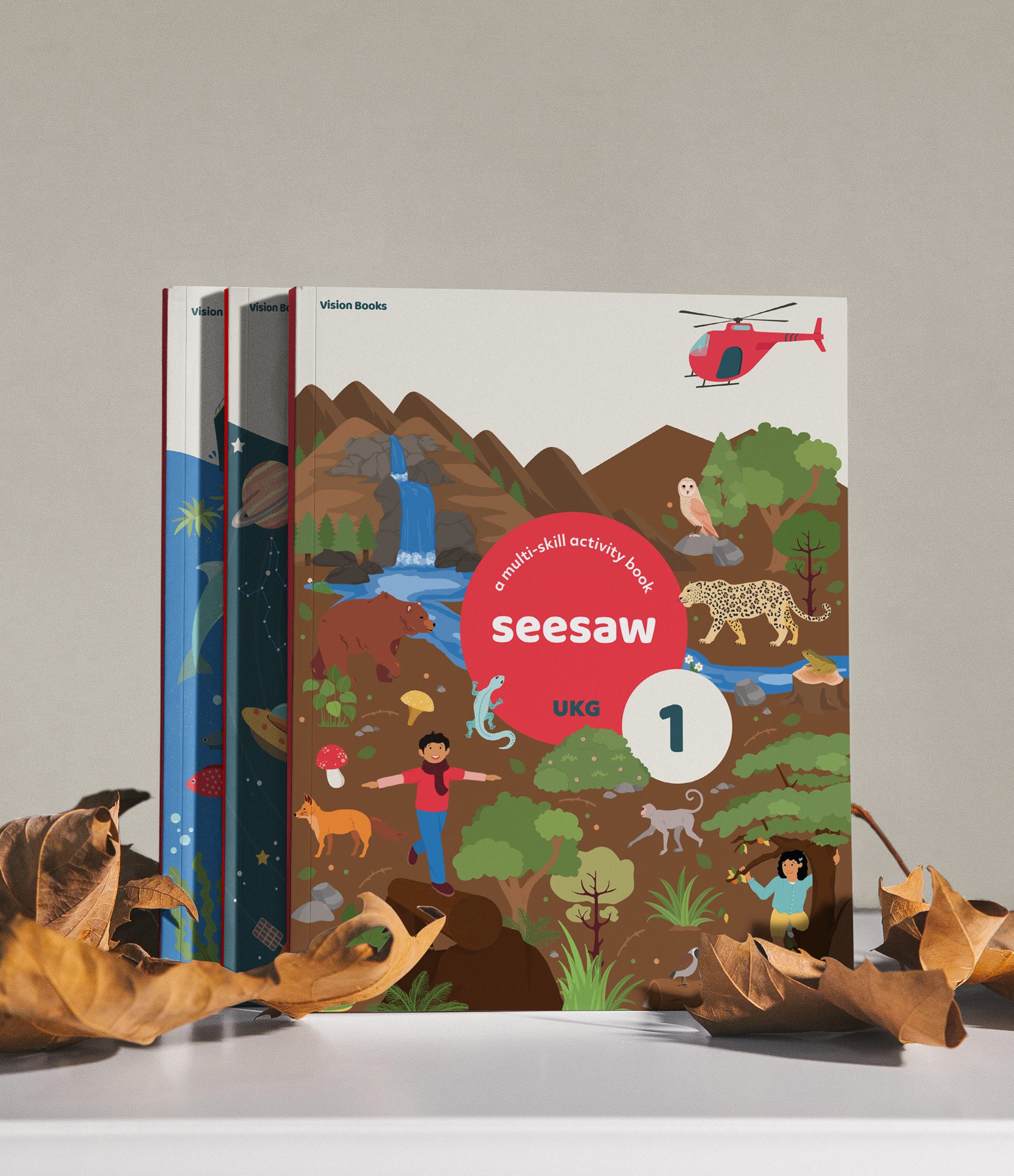
The Themes
Right at the get-go, we knew the book covers would be the primary marketing tool our publishers could use to establish the new brand and announce the design overhaul. So we chose this critical piece of real estate to create a place of engagement for our young learners, where every time they picked up the book, there was something new to discover.
We selected a theme for each book based on a natural environment—the forest, mountains, desert, seaside, underwater world and outer space. With vibrant colours, and numerous little illustrations on each, the covers were each remarkably different while held together as a cohesive set with a clear structure.
No detail was too small, and we paid careful attention to the spine with circles representing the book numbers 1, 2 and 3 for our young learners who were only just beginning to read.
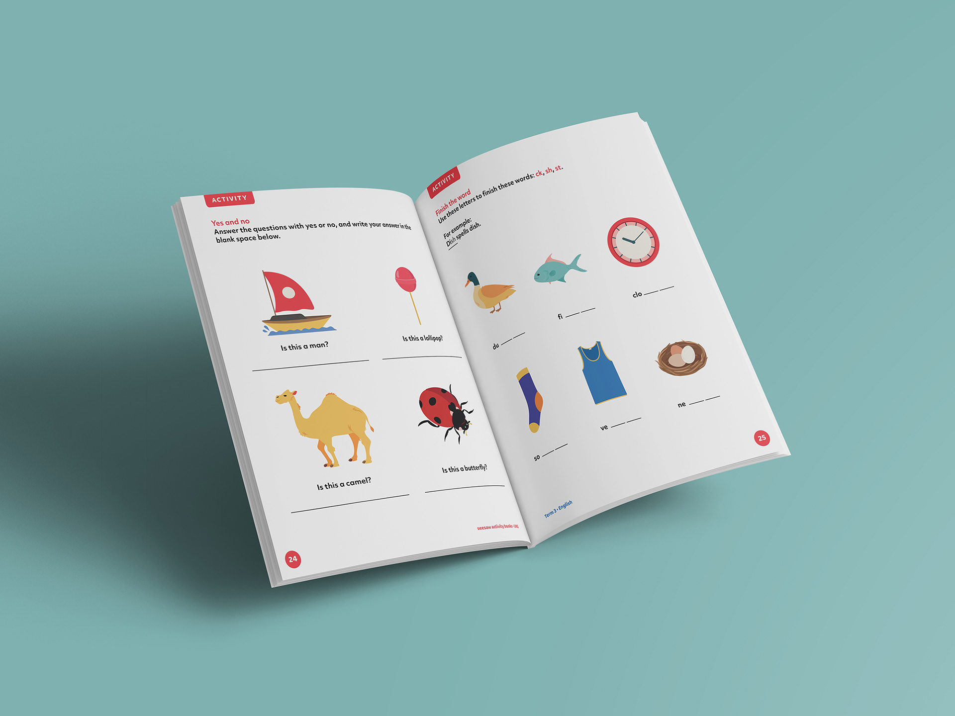
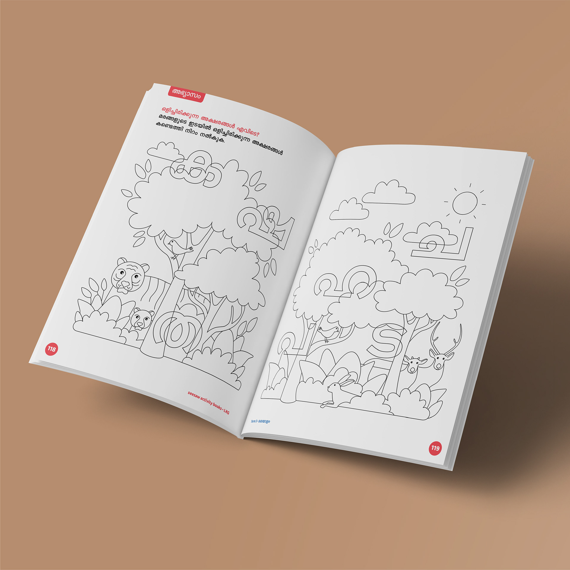
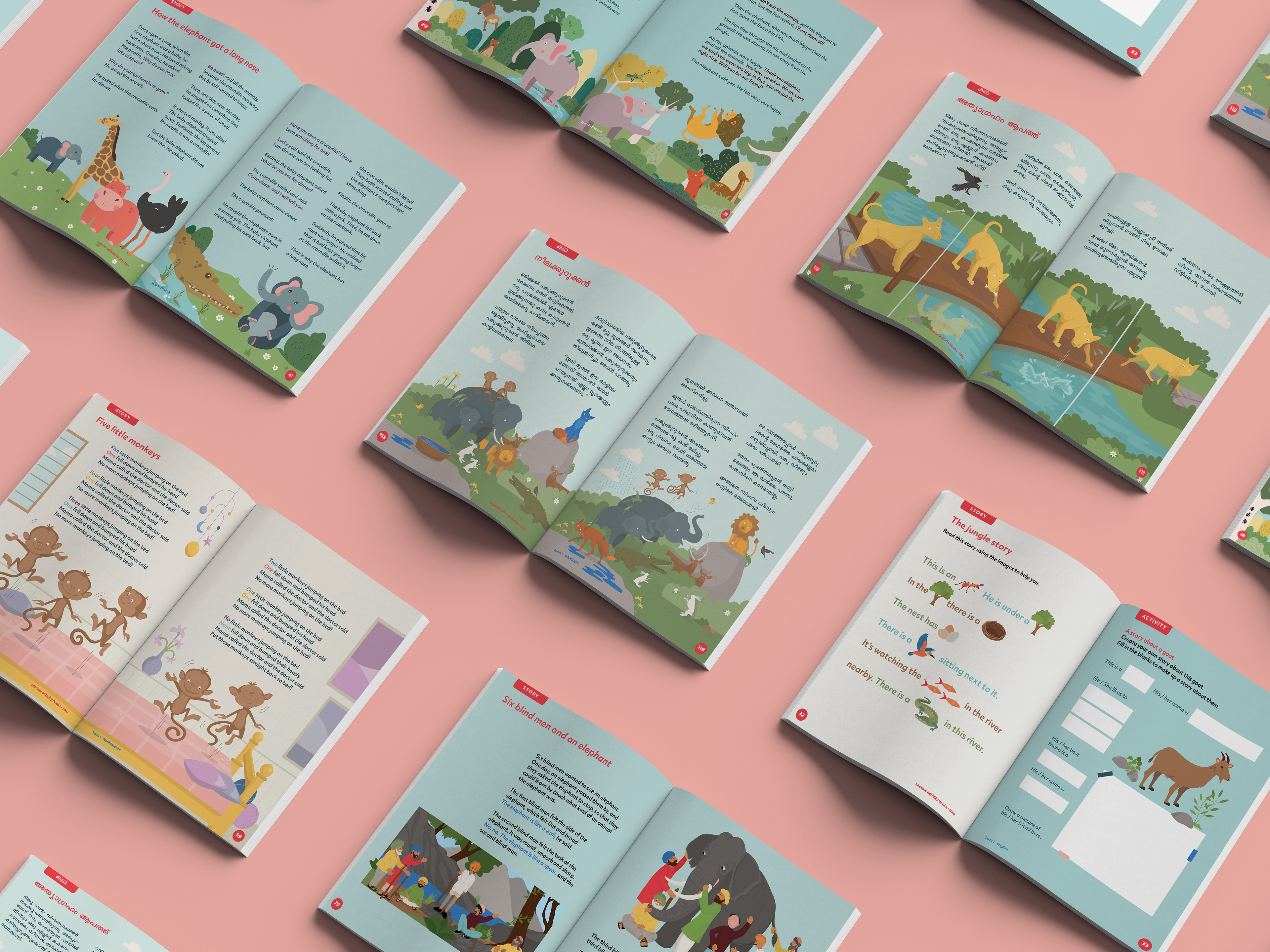
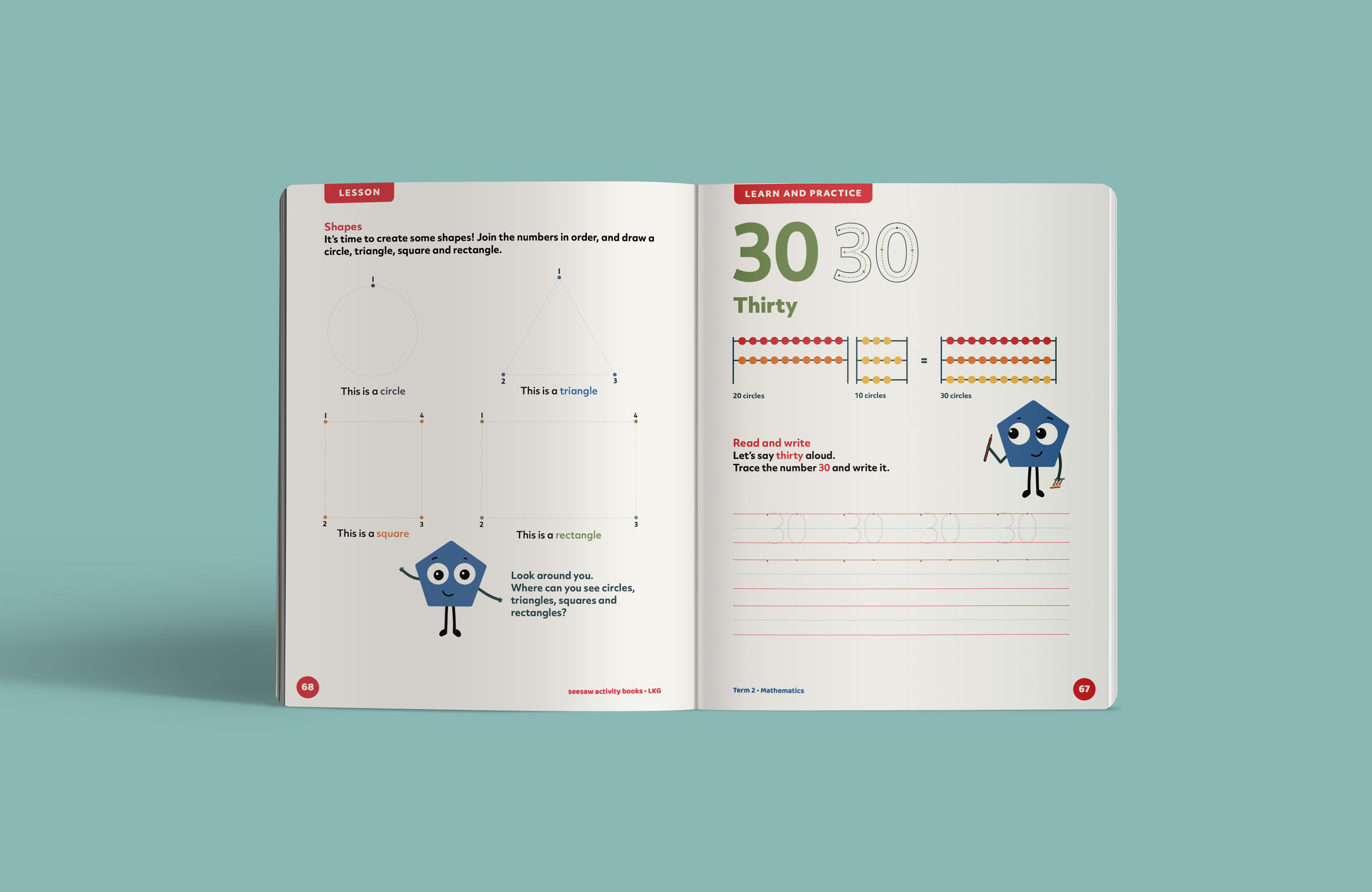
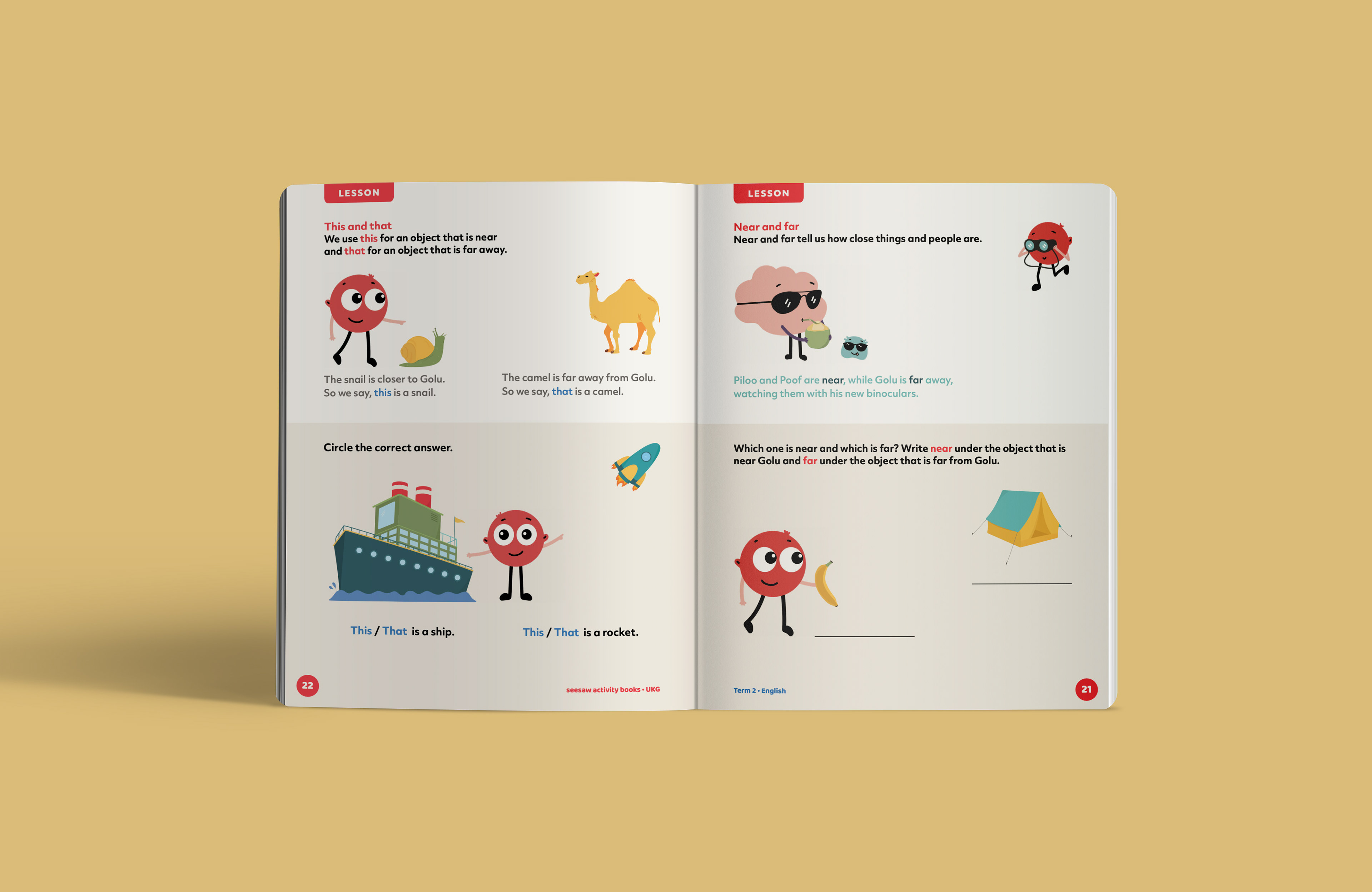
Designing the Inside Pages
Fundamentally, we aimed to make intelligent, thoughtful design accessible through material for young learners; to re-think content and structure to encourage discovery, curiosity and engagement. We set out to embrace production and budgetary constraints rather than fight them, with a visual system that was inexpensive and scaled. Fundamentally, we aimed:
1. To make content relevant and replaced outdated images with current, more accurate ones.
2. To build a consistent illustration and visual style and avoid the arbitrary use of photographs.
3. To design simple, uncluttered easy-to-navigate pages and minimise cognitive overload.
4. To consciously move away from problematic material and depictions that further stereotypes.
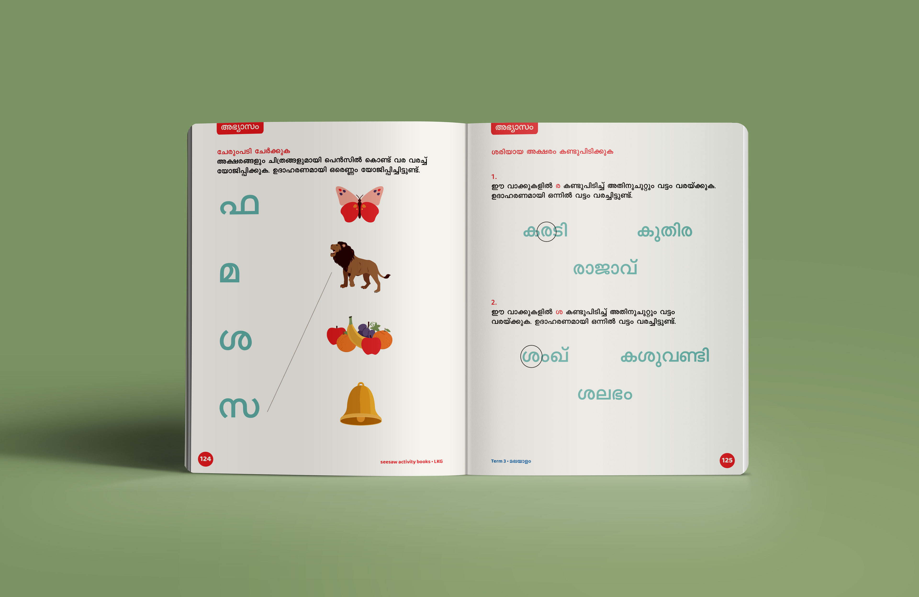
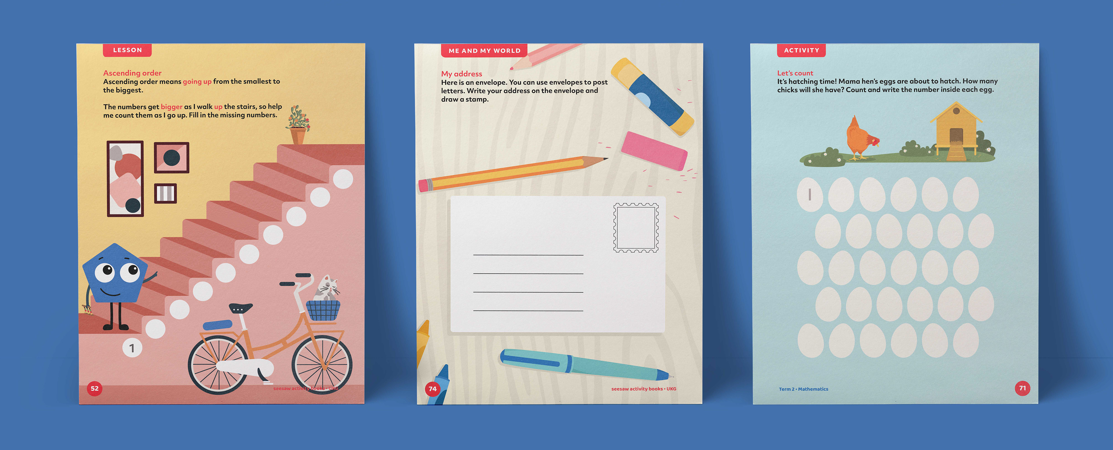
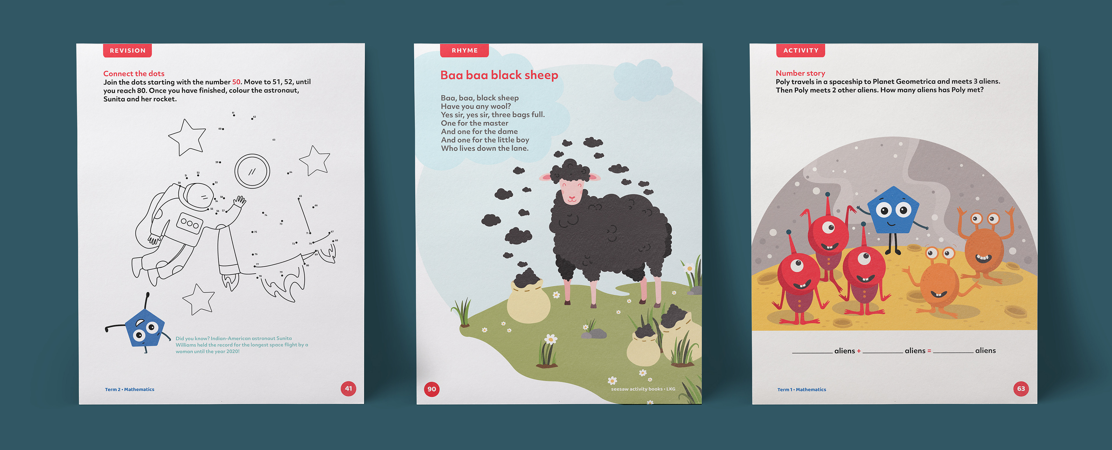
5. To include more engaging exercises combined with interesting visual devices.
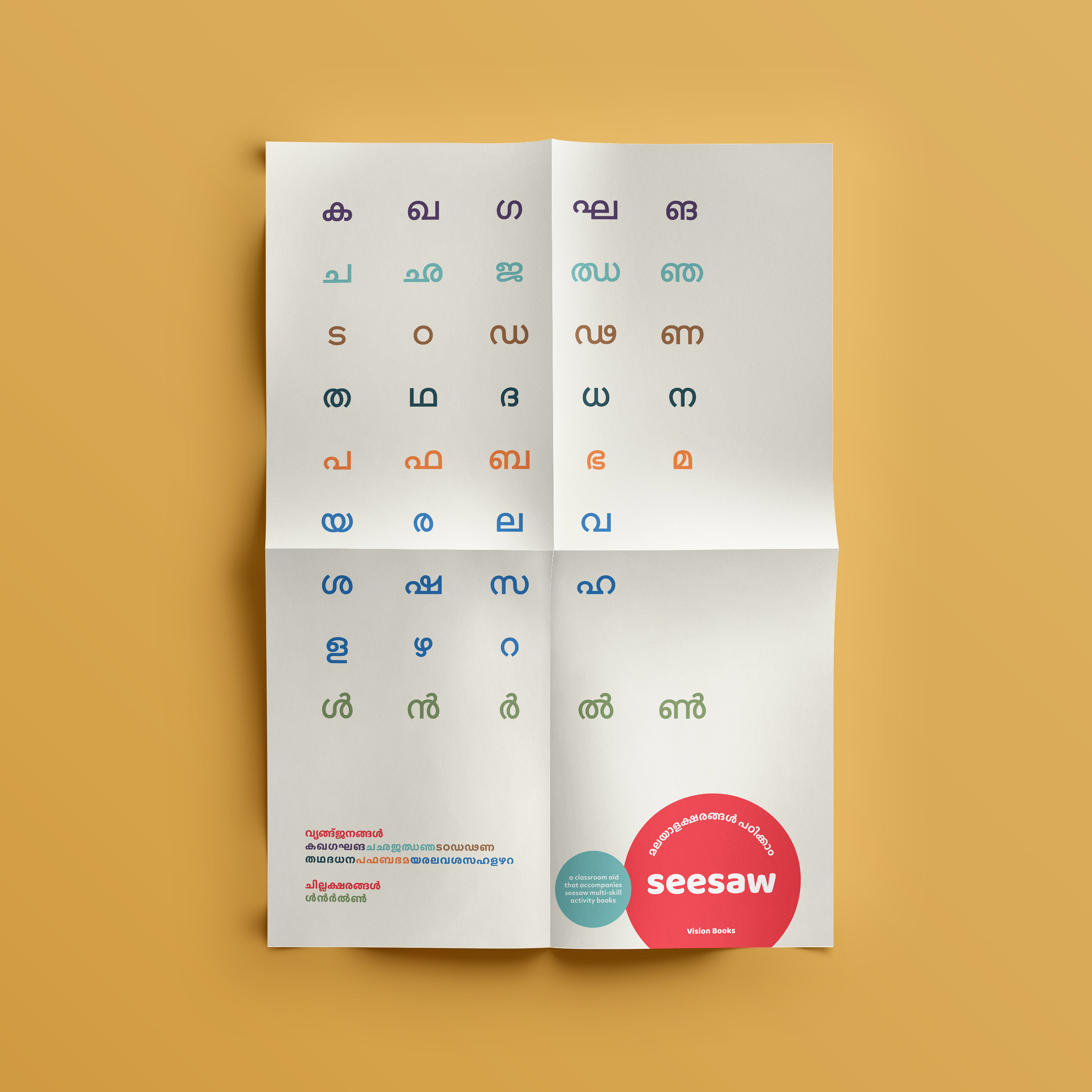
6. To build a typography system that prioritises legibility and encourages reading in both languages.
7. To focus on, and improve tone of voice, language and grammar in both instructions and content.
Every Page of Every Book was Designed with Intention
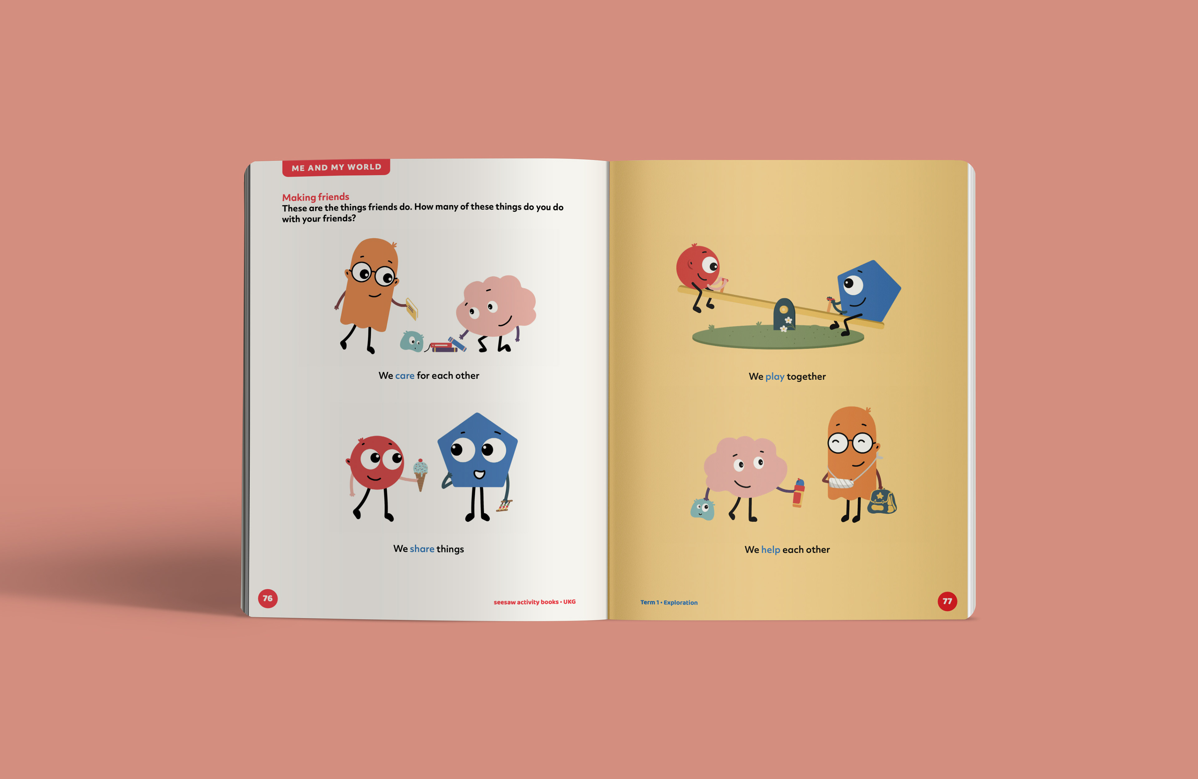
Learning to make connections
The ability to make connections is a critical part of learning. Through the books, we incorporated familiar visuals and actions and used them as learning aids. Our research cautioned us against over-crowded pages, and we designed each of them to remove cognitive overload.
We prioritised open space and simplicity, making room for children to observe, read and write. Repetition is critical for early learners, but we made sure to never lose the opportunity to stimulate thinking. Activities and exercises were designed to encourage curiosity and deep learning.
To ensure continuity and connection, it was essential that our visual style could be adapted seamlessly across subjects and languages.
Nurturing curiosity and imagination
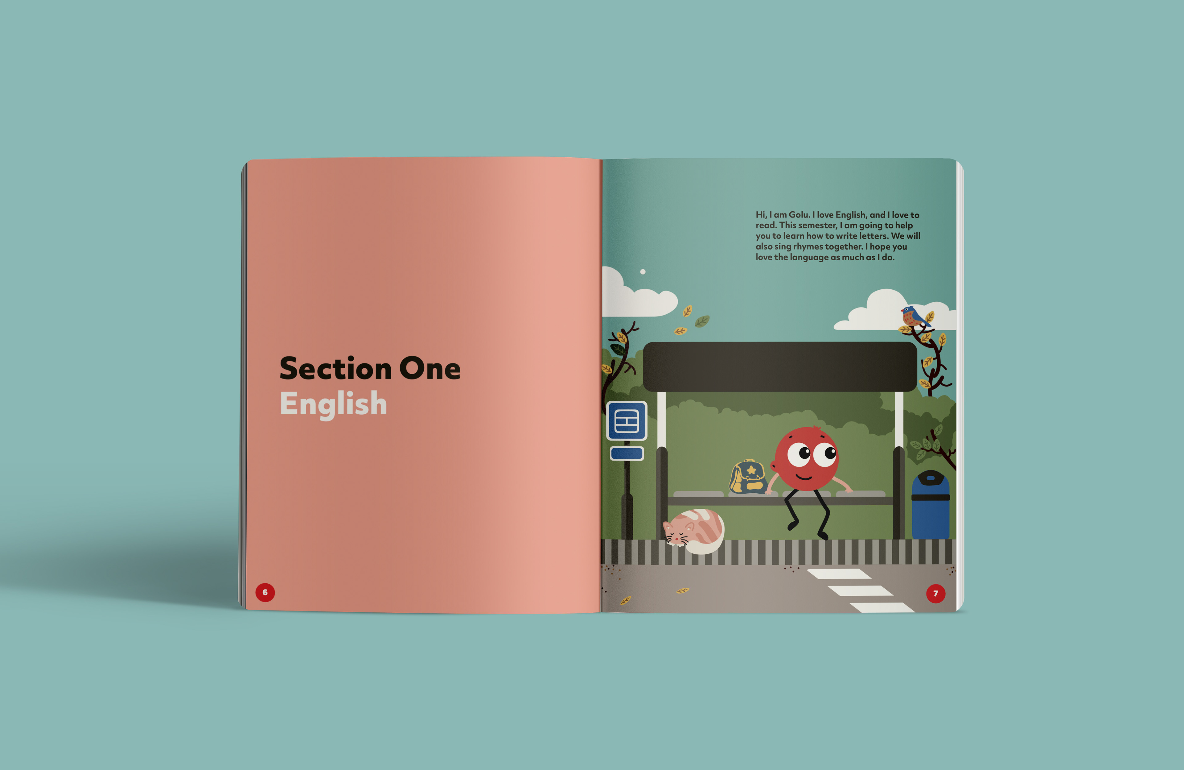
Story-telling is a large part of the early learning, and our illustration style with vibrant colours, immersive imagery and simple forms was developed to draw in young learners and keep them engaged. One of the core tenets of designing for learning is to imbibe the ideas of discovery, curiosity and imagination in children’s minds.
In addition to the Seesaw activities book covers, we used exercises and activities drive this idea. It has trivia for curious minds, visuals that create intrigue, and encourages critical thinking and an appetite for investigating the world around us.
Addressing gender with sensitivity
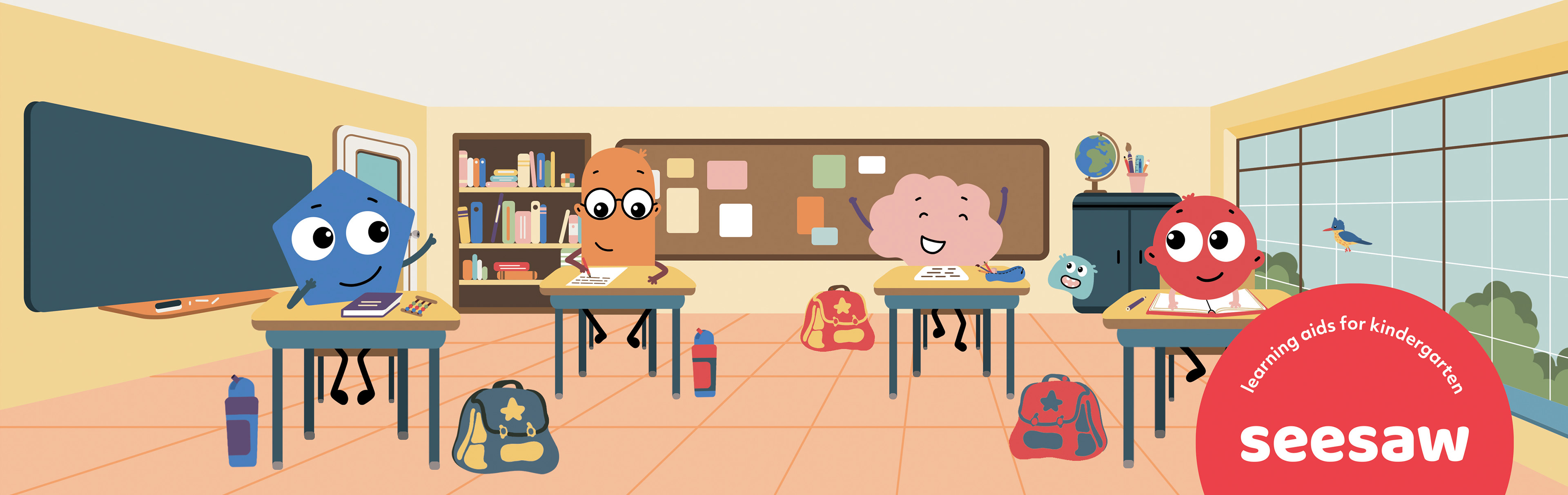
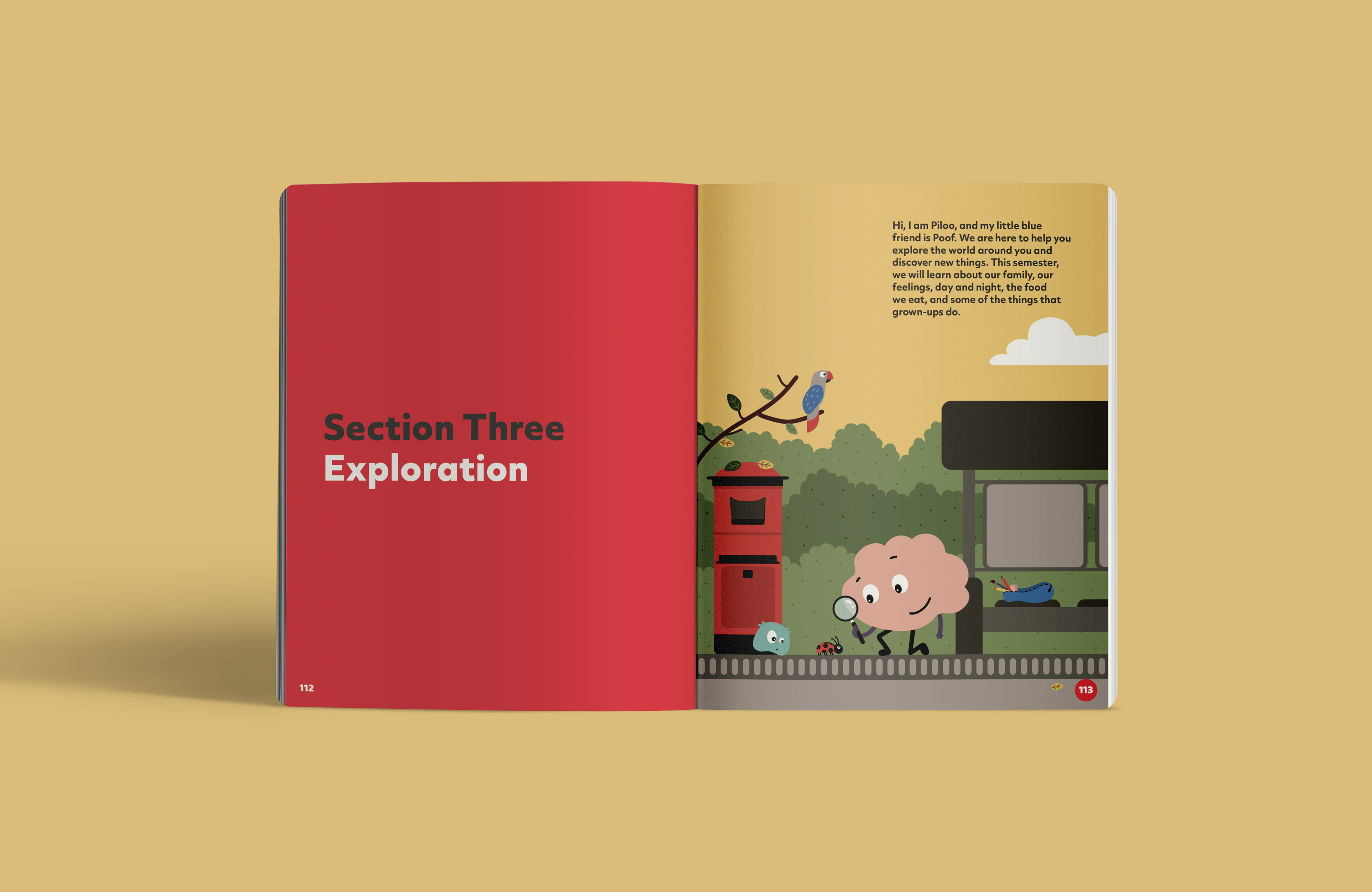
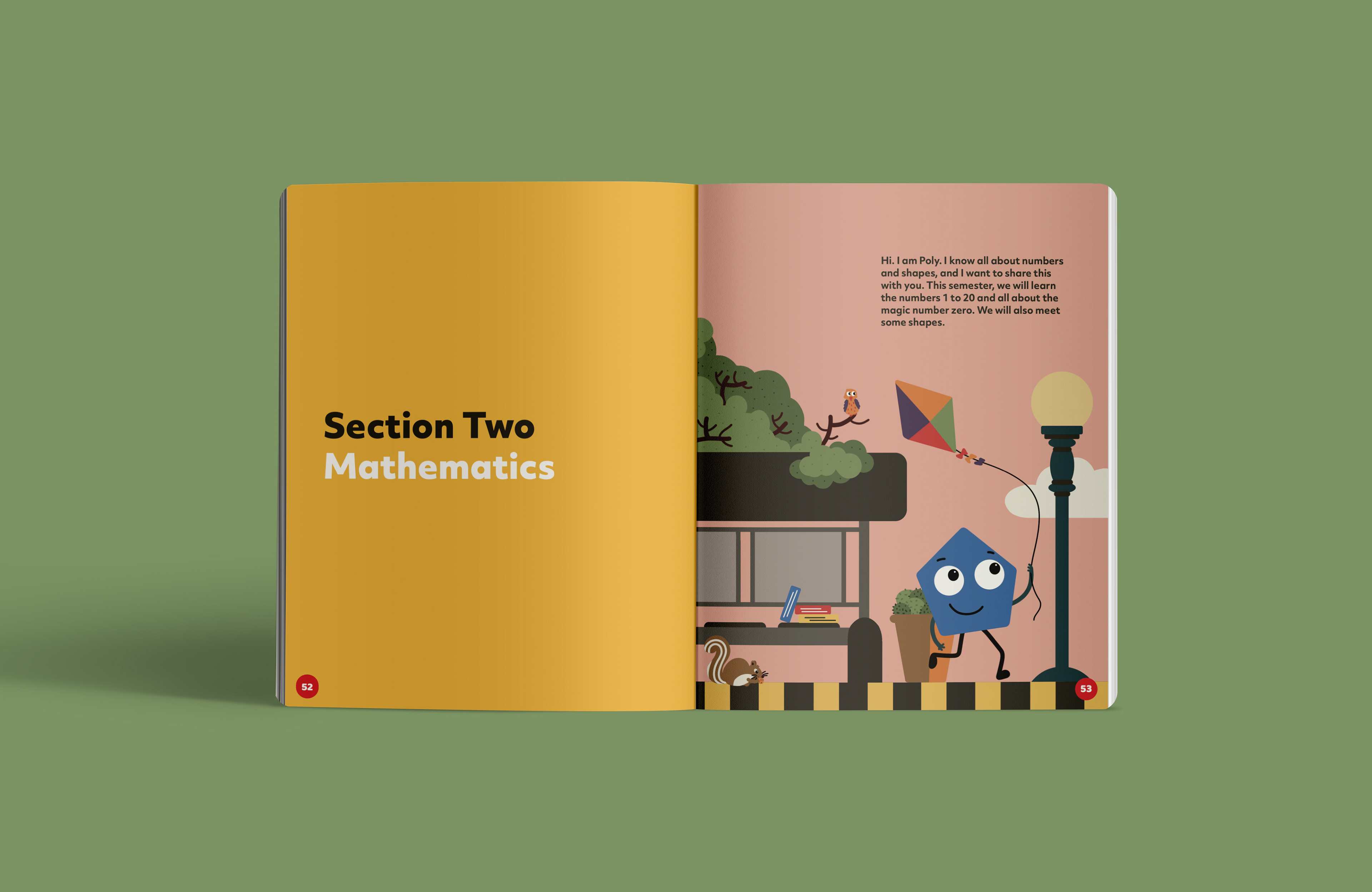
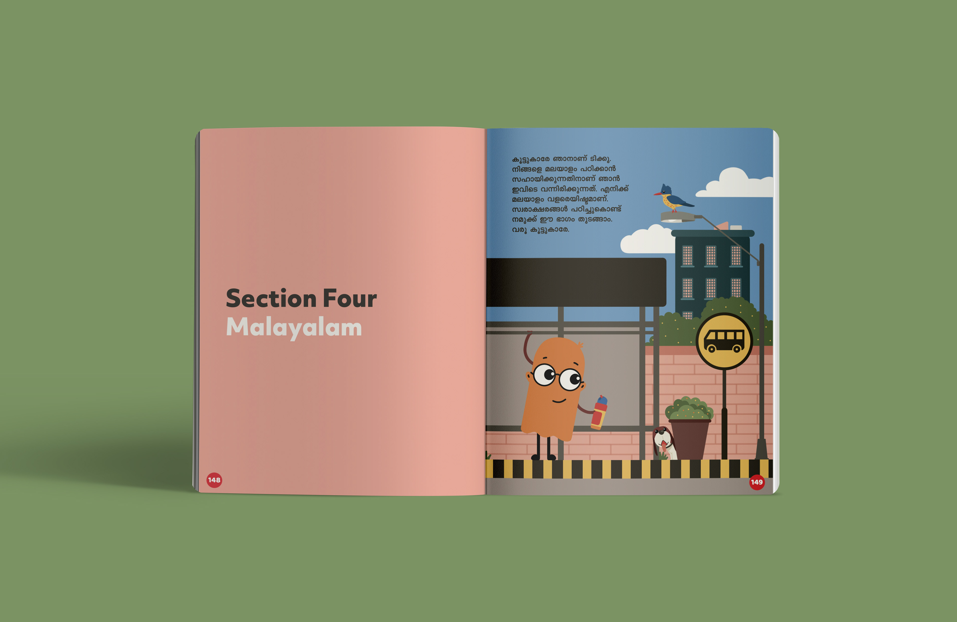
As a key differentiator of the Seesaw brand, we developed a family of emotive, gender-neutral characters that made appearances across the books, with one character representing each subject—English, Maths, Exploration, and Malayalam.
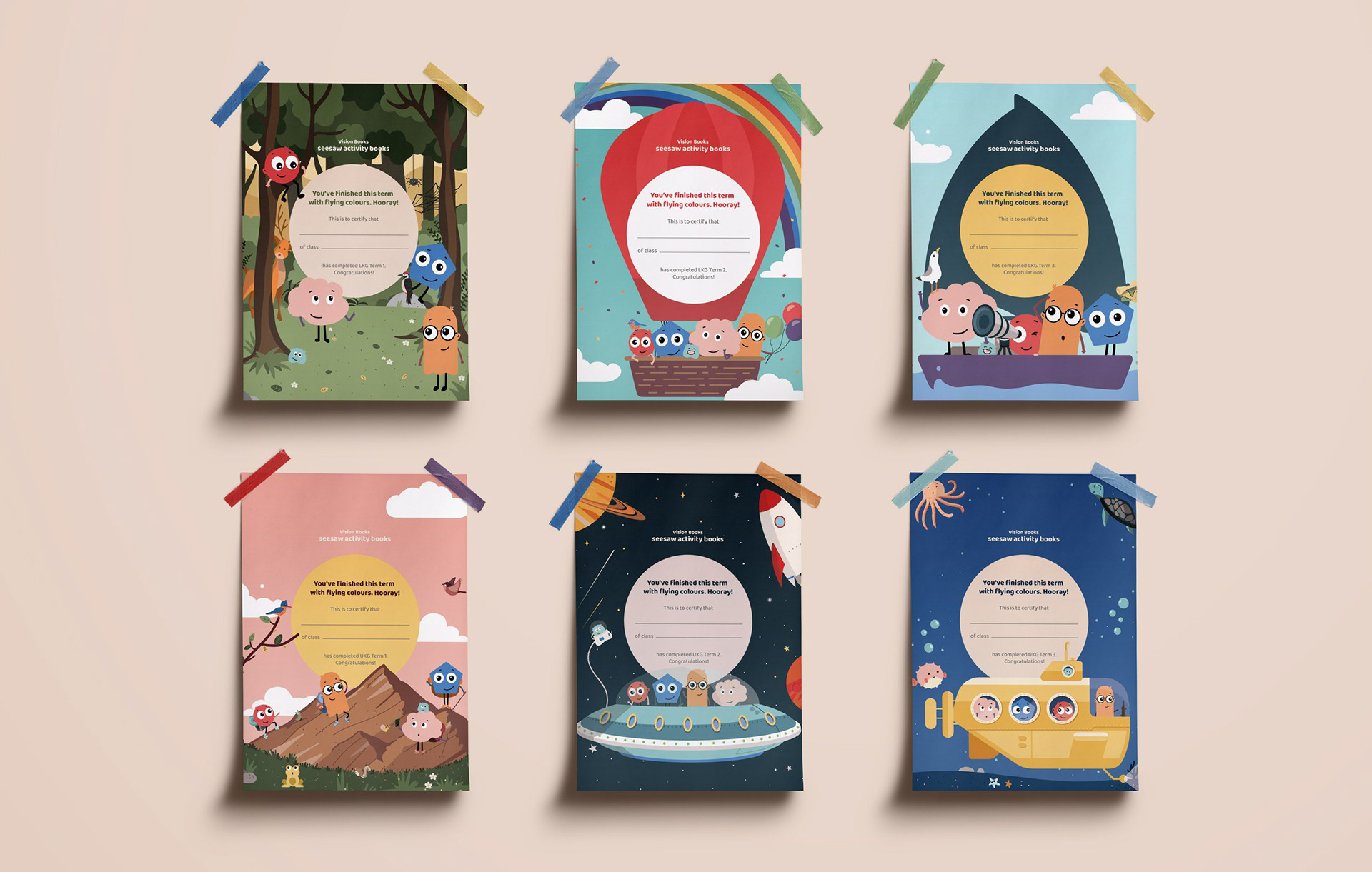
Positive reinforcements
A sense of accomplishment always encourages learning, and with early learners, positive reinforcement has been shown to be very effective. We ended every book with a certificate that could be detached and filled in, to prompt teachers, parents and children to celebrate the completion of each term as an accomplishment. The certificates included all the characters in a context that matched the theme of every book cover.
Made teaching easier, learning enjoyable
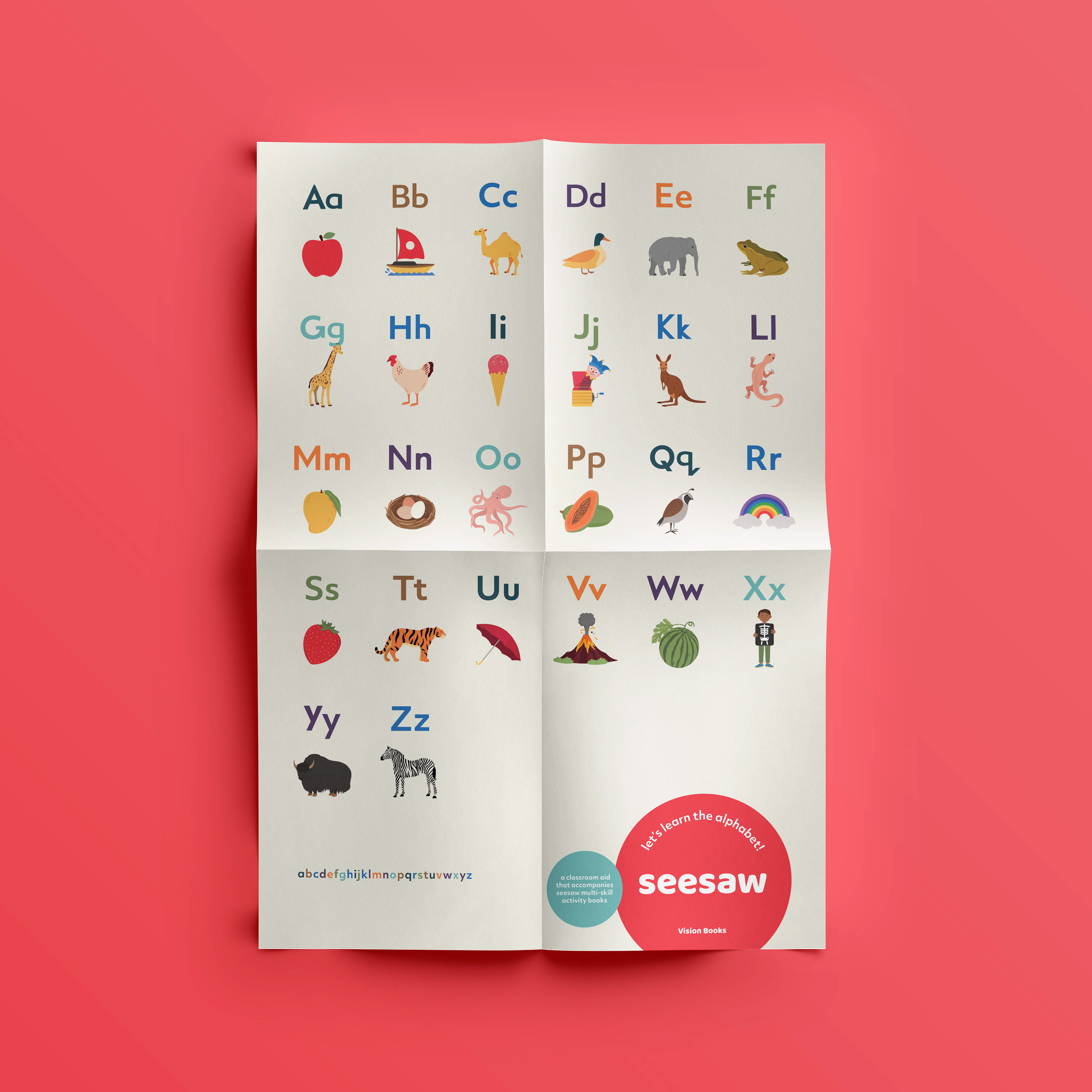
Our approach to design included a balanced focus on content and visual style. Every decision aimed at making teaching easier for teachers and parents, and learning more enjoyable for children. Through thoughtful teaching methods and immersive imagery, we built a strong, distinct style that extended through sets of books, flash cards and posters.
Preparing the Sales Team
Ensuring that our research, guidelines, and outcomes reach the end-user
Towards the tail-end of the project, while Vision Books' team was testing the material at various schools, we noticed a significant reluctance among teachers to adopt this new material. They were hesitant because the material looked visually different from the texts they are typically used to, and understandably so.
A major reason for this reluctance was that the sales team was not equipped with enough information to convey all the research and outcomes that resulted in this book. The solution was to prepare our sales team with a detailed document regarding all the design and content interventions that we had adopted to make learning easy and enjoyable for children with varying learning abilities.