Overview
Sahana Jose, who heads the Communication Team at Rohini Nilekani Philanthropies (RNP), and I have been corresponding for a few years, exploring how we might best collaborate on a design project. In April 2024, our schedules finally aligned, and I was commissioned to design RNP’s Annual Report for 2023-2024.
The report, published as a digital PDF on their website, highlights key activities, insights from the past year, future goals, and financial statements.
CLIENT
SECTOR
Not-for-profit
AREAS
Concept Development
Editorial Design
Design System
Illustration
PERIOD
May – August 2024
RELEASE
August 2024
key client personnel
Sahana Jose, Associate Director - Communications
Shruti Sundaresan, Lead - Comms and Community Engagement

Context
Rohini Nilekani Philanthropies is dedicated to driving social change through collective action, focusing on a people-first, society-first approach. Over the past five years, their work has expanded from education and water to include justice, gender equity, independent media, active citizenship, and environmental initiatives. Their mission is to strengthen society (“Samaaj”) by empowering passionate leaders and supporting innovative solutions to social issues.
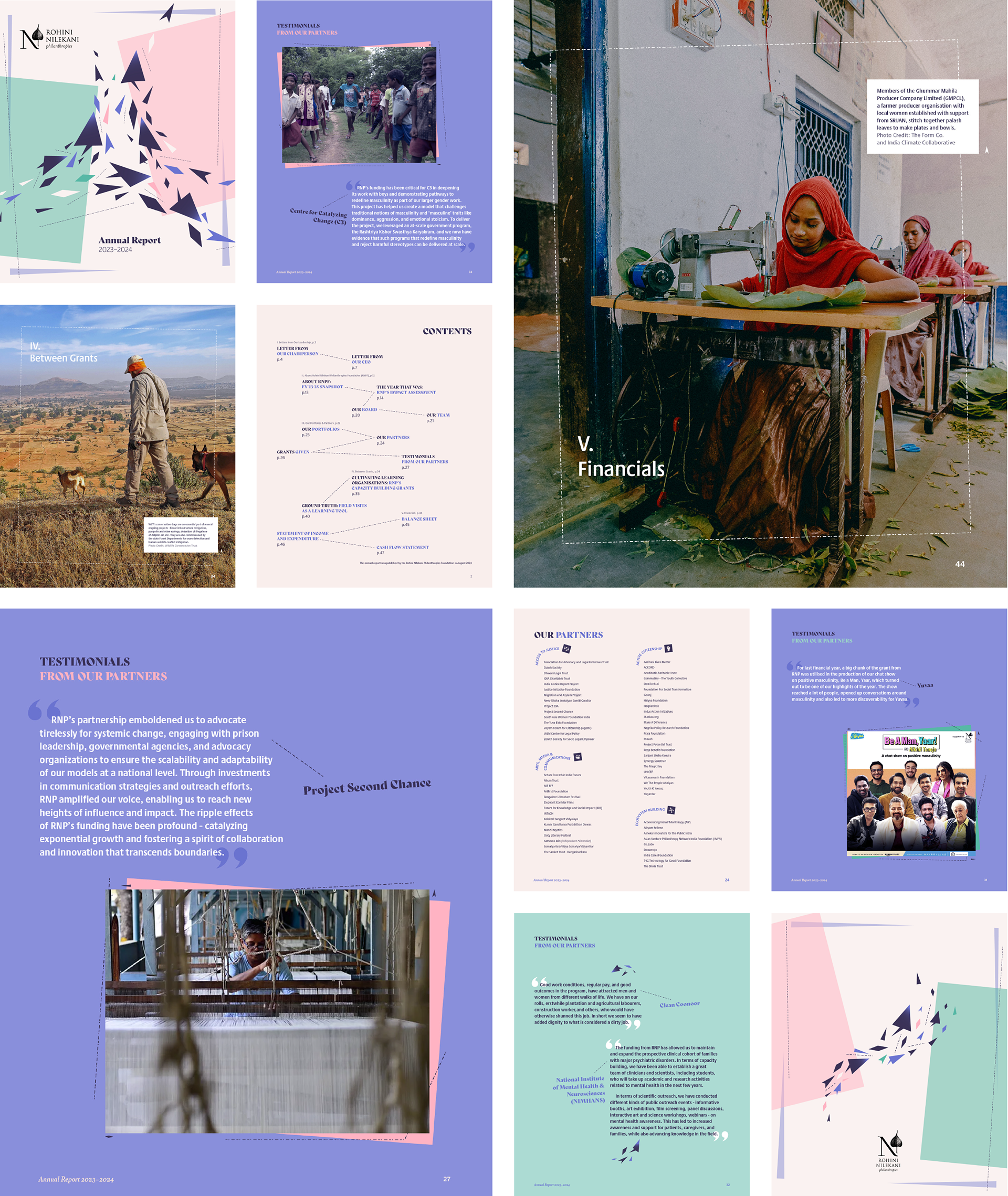
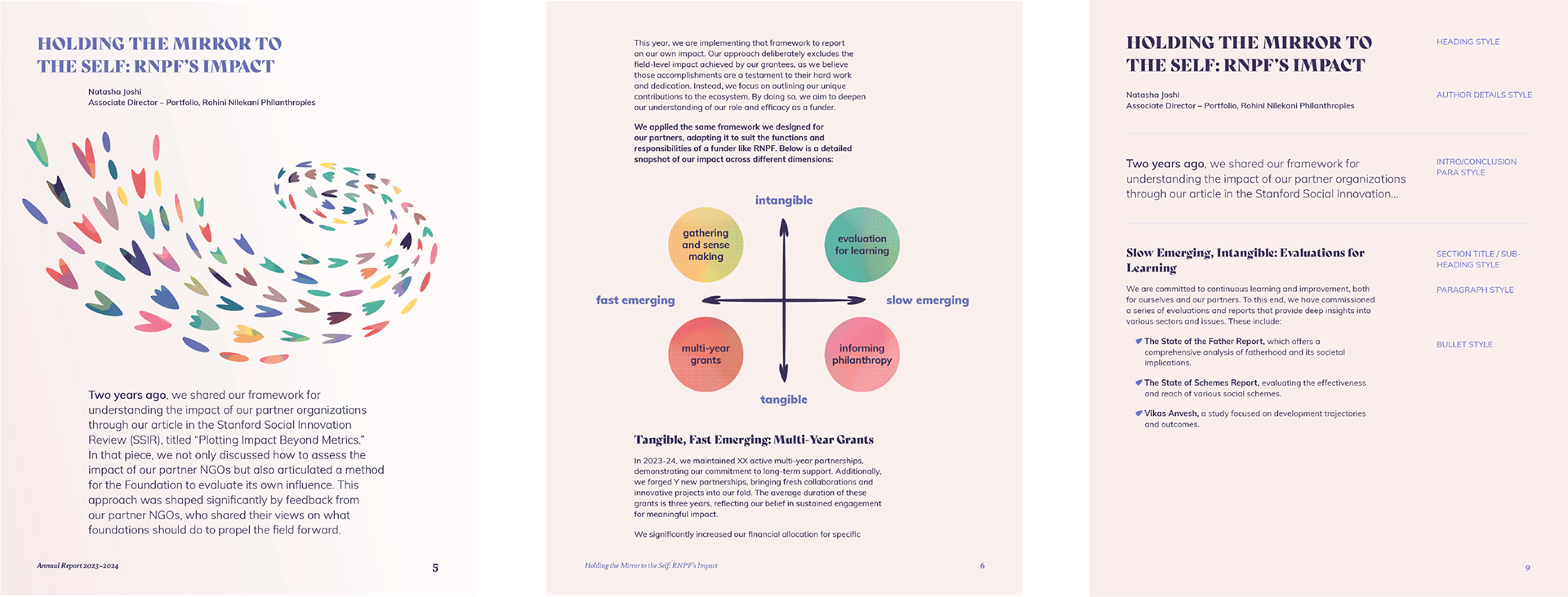
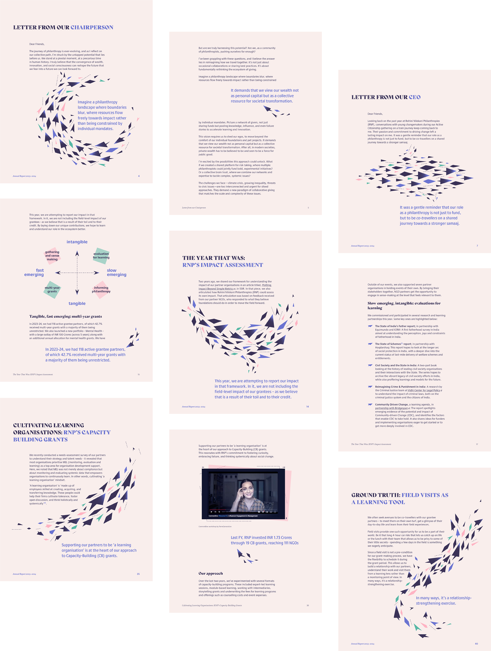
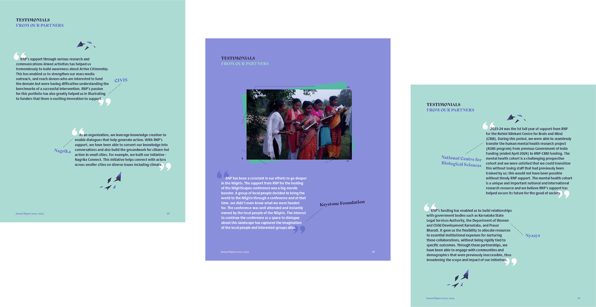
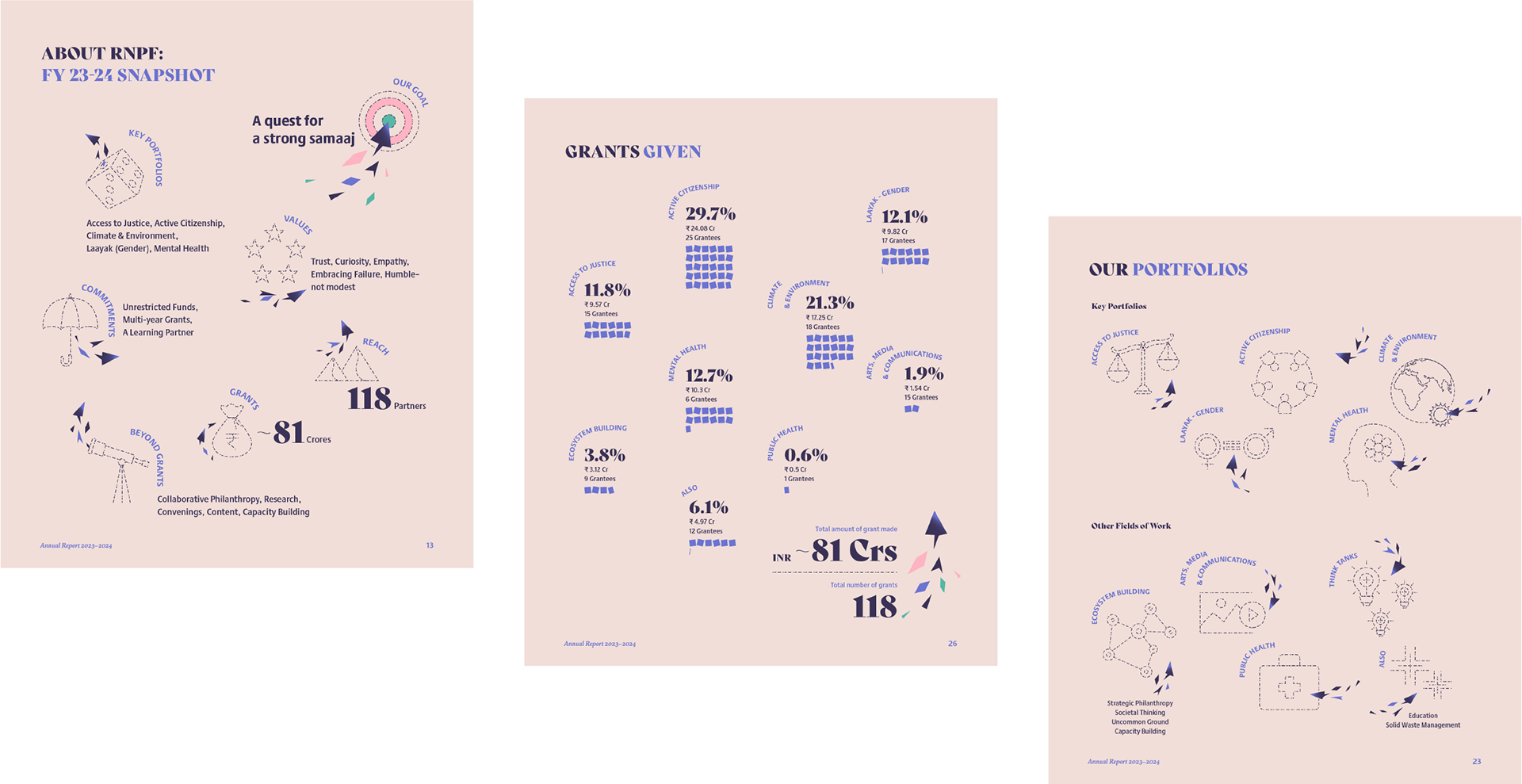
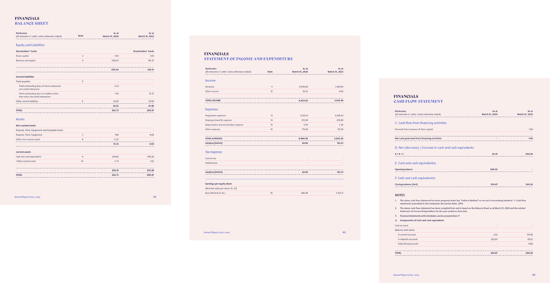
A few pages from the RNP Annual Report 2023-2024
Crafting the Core Idea
My task was to develop a visual concept that captured the essence of the year, centred around a significant train journey the RNP team took with their partners (grantees) from Bangalore to Mangalore.
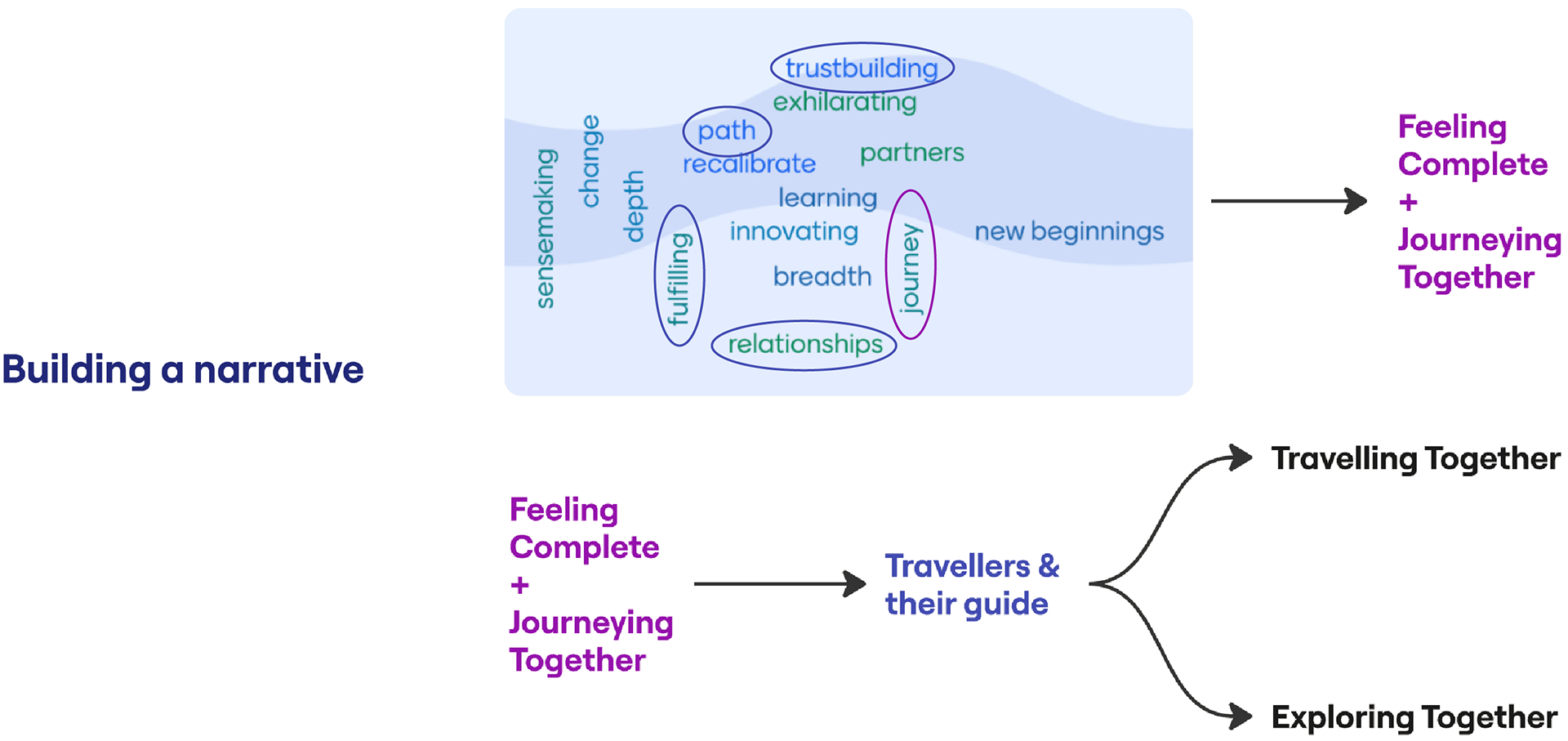
This journey, which led to workshops and discussions beneficial for both RNP and their partner organisations, became a focal point for the report. The team had shared a word cloud from their internal brainstorming sessions, and they were particularly drawn to the theme of "journey."
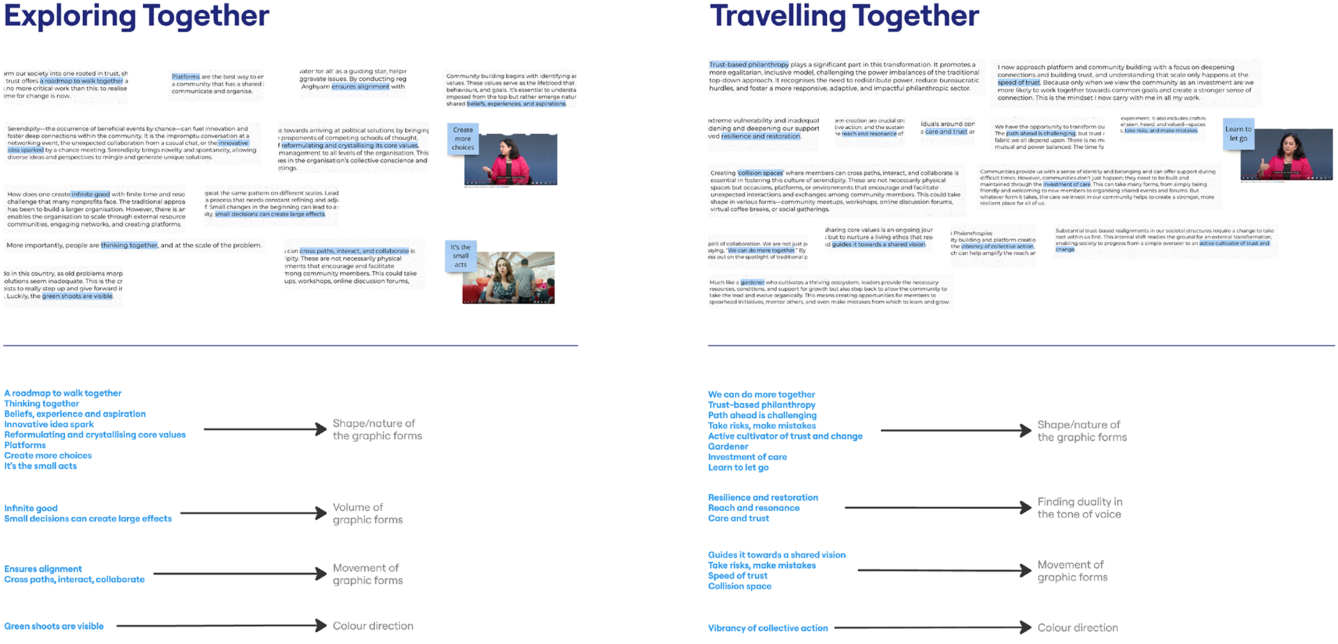
The visual concept needed to reflect this experience as well as the sentiments expressed in the written content. From our discussions, two key themes emerged: Travelling Together and Exploring Together. I used these themes to create key page visuals and developed a style guide to ensure consistency throughout the report.
Charts from the workshop session
I used these themes, along with material shared by RNP—articles, videos, and blogs on their activities throughout the year—to shape the visual direction. These themes were further developed into a moodboard during our workshop sessions, where we refined the visual concept.
Moodboard
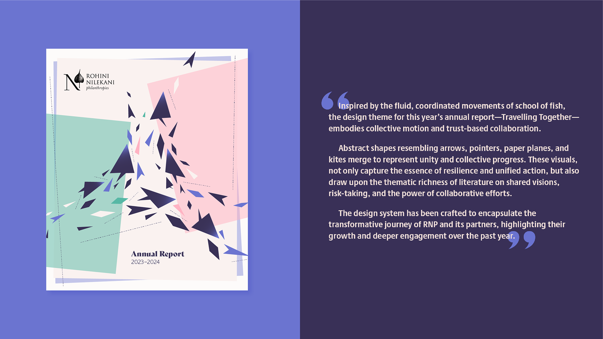
The team was particularly drawn to the idea of Travelling Together. As I began sketching and visualising a direction, I focused on phrases like "vibrancy of collective action," "trust-based philanthropy," "speed of trust," and "guiding towards a shared vision." These ideas reminded me of schools of fish in the ocean.
I started looking at images and videos, but the most compelling visual I found was an oil painting by the artist Paula Dooley called The Fish Swirl. I was captivated by the vibrancy of her colors, the use of light, and how she used the form of countless fish to convey a powerful sense of movement. (Unrelated to this project: I discovered Paula quite serendipitously. Do take a look at her paintings—the way she treats light and shadow is exquisite!)
visual guiding Board
To bridge RNP's ideas with potential visual forms, we worked together in developing a reference board to guide the report's visual language. This board included references for shapes, colours, typefaces, and typographic styles.
I envisioned incorporating visuals inspired by the formation of schools of fish throughout the report. This secondary guiding board provided a deeper sense of the overall design direction. It was a crucial step before starting the design process, offering the client a glimpse of what to expect during the design exploration stage.
This allowed me to visually articulate the words and ideas I had been gathering. None of the reference visuals were used; they simply served as guidelines to help the client visualise the final product.
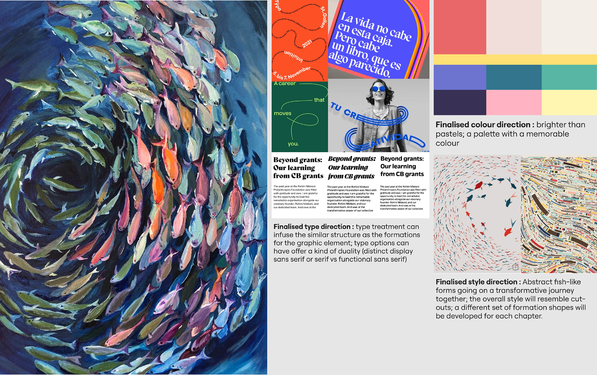
Moodboard: Paula Dooley's The Fish Swirl (left); Sample references for colours, typographic direction, graphic style direction (right)
Design Process: Envisioning the Journey
Key Graphic and Colour Options
The first iteration of the design featured soft, rounded shapes and a dynamic colour palette to reflect the energy of the journey. However, feedback indicated that the design felt too playful, and the client requested more depth and maturity in the visuals.
Early exploration of graphic forms, typesetting style, style for infographs
In response, I revised the design to feature sharper, more directional forms evocative of arrows and kites, symbolising movement and purpose. The colours were toned down as they were making the forms overly playful. The movement alone was sufficient to introduce an element of play.
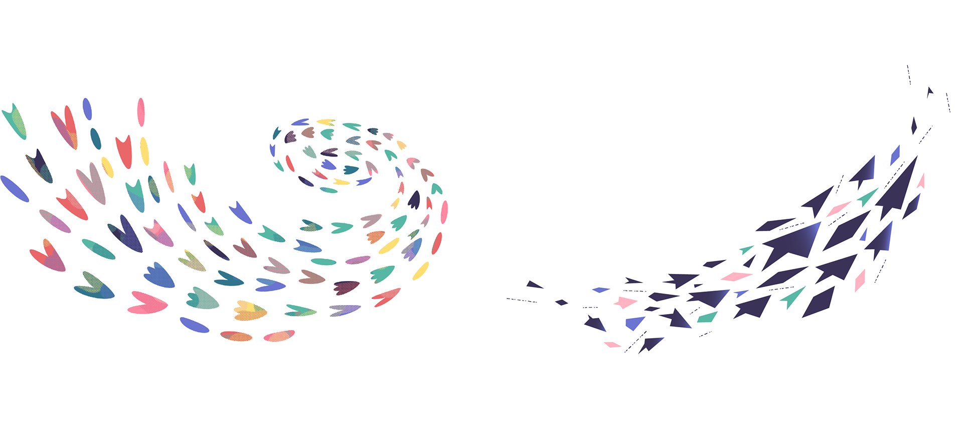
First exploration versus second iteration
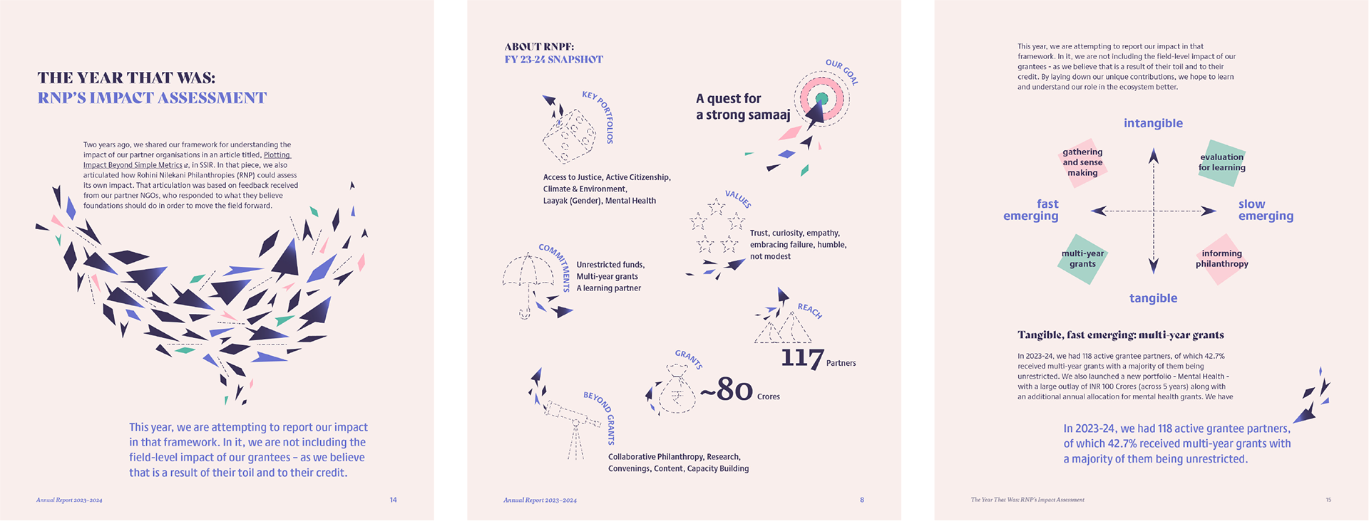
Inside page designs as per the second style that was employed
These key graphics were applied to five main article pages, designed to interact with both the surrounding text and other visual elements. A simplified version of the graphics was used to highlight callouts and create visual anchors, while the layered design was adapted for the report cover.
Typography
The typography complemented the graphic elements. I chose Bely Display by Type Together for the display text, with its sharp contours echoing the arrow-like shapes of the design.
For practical content such as body text, subheadings, captions, and tables, I opted for Praxis Next by by Gerard Unger, Monotype Design Studio, Linda Hintz and published by Linotype, a versatile type family with multiple weights and forms.
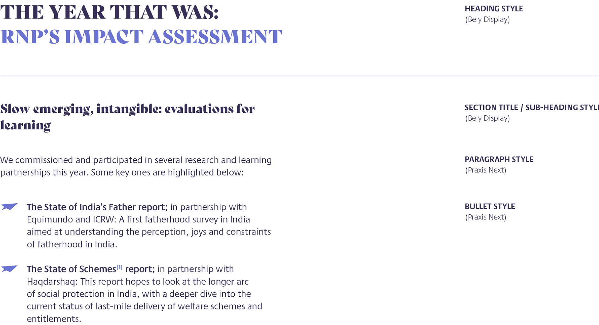
Type styles used in the report
Report Format
Given that the report was primarily intended for online distribution via email and the RNP website, I opted for a portrait format (600px x 720px) that would be easy to read on both desktop and mobile devices. After testing various sizes, this format proved ideal for digital consumption.
A portrait format is typically easier to read on mobile devices, and a narrower viewing port also aides reading on desktop screens. The chosen size was carefully balanced—not too narrow—ensuring it would fit within the limited vertical space of desktop displays while still being user-friendly.
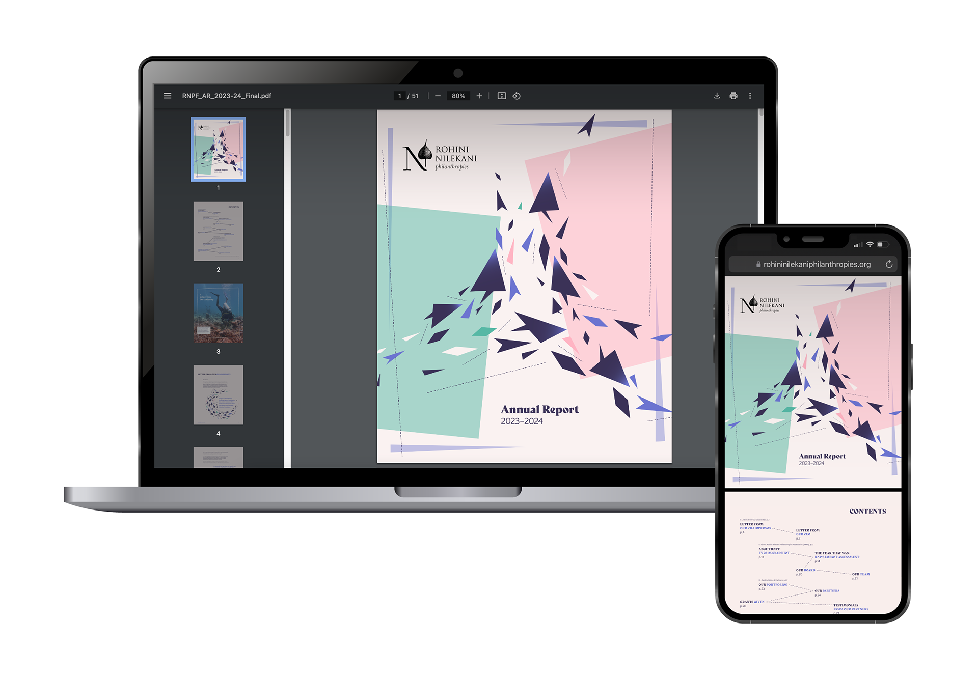
A standardised non-responsive size that was optimal across most screen viewports

Final Outcome: Structuring the Pages, Creating Components, and lastly, the Report Cover
For most editorial design projects, I usually begin with the cover design, using it to set the tone for the rest of the content. Most clients are comfortable with this approach. However, for this report, I had the opportunity to try something different. Sahana and Shruti were more open-minded about reversing the process, which also helped save time.
I decided to first create a design system, starting with the key article pages. This system, built around a modular graphic device, established the visual language for the entire report, including the cover. This is a technique I learnt while working on web projects with the web-design studio, Miranj—where they often leave the homepage design for the end, building the overall system first.
The cover was the final element designed, serving as the culmination of the overall concept—like placing the cherry on top of a cake.
The Key Articles
Testimonials
Infographic Pages
Ambient Imagery
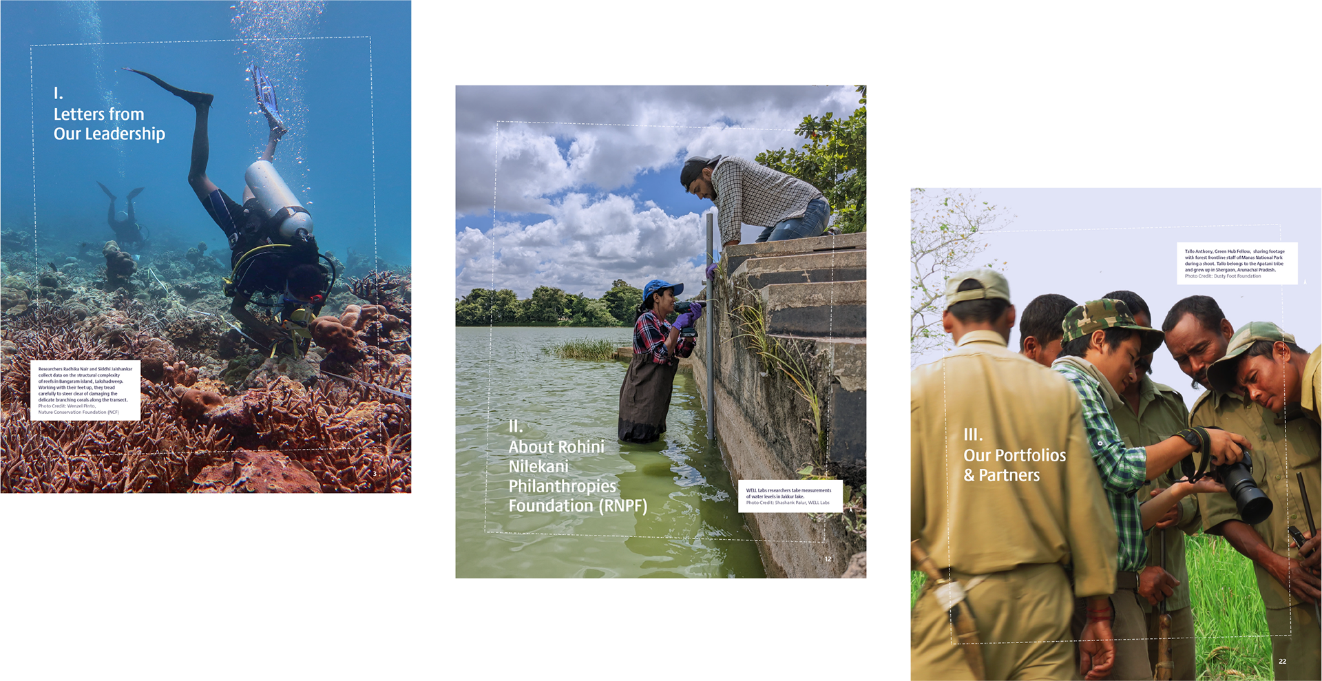
Financials
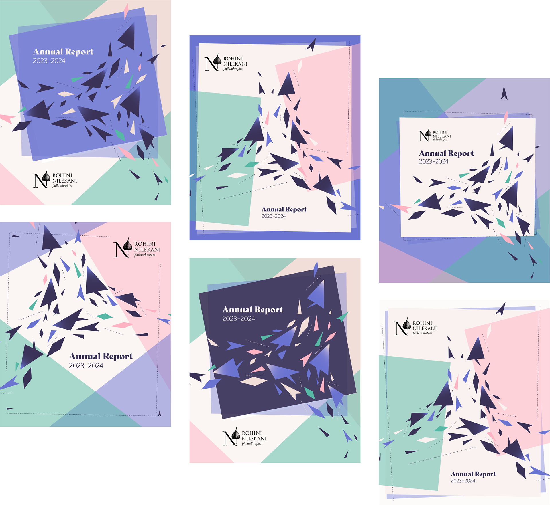
the report cover
With regard to the process, the cover was always planned to be designed at the very end. It was intended to be a culminating piece, best informed by the content and design of the report's inside pages. Initially, a design based on a circular formation—a shape complete in and of itself—was proposed. However, it was considered too energetic and dynamic by the RNP team, who requested a more subdued approach.
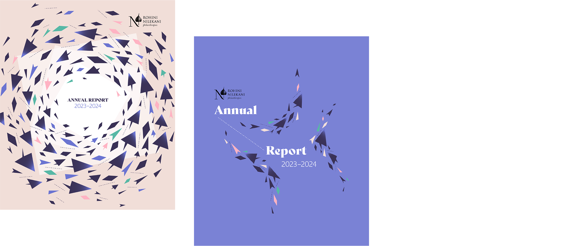
An off-centred design was then explored, but it was found to lack impact. THere was a request to brighten it up and to layer it further.
Finally, a cover was created featuring three converging forms—or forms that appear to be coming together. This design felt appropriate as the concluding piece. Layers of graphic elements from the design were incorporated to add depth.